
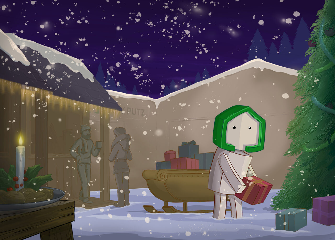


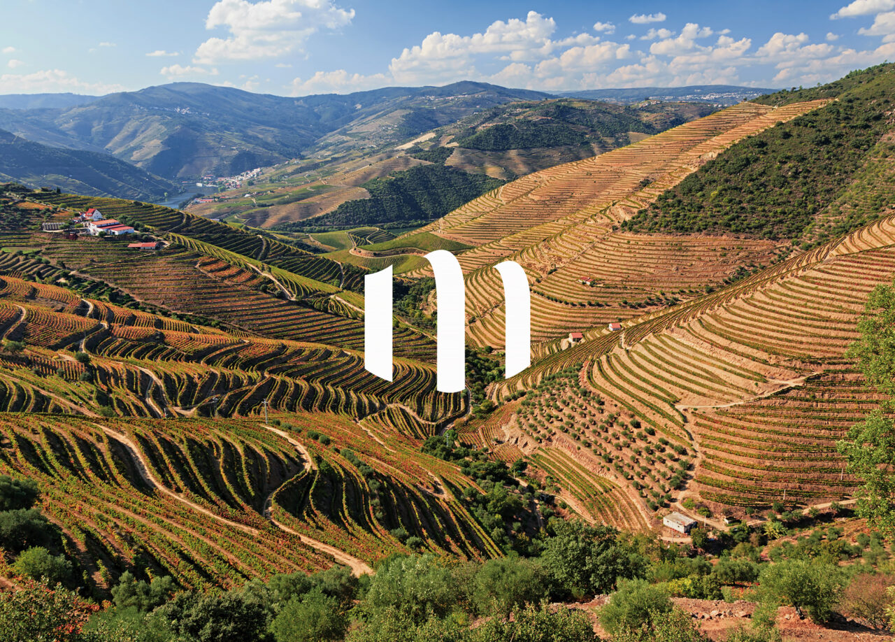


Graphic design is a source of understanding and experience. It brings joy and offers inspiration. The driving force behind creativity, is the search for meaning.
Nova is a creative studio working in various design areas for social
and/or public institutions as well as cultural associations, private companies or start ups. The studio has its focus on human and socially oriented projects.

Method
Nova is a branding and design studio dedicated to deliver strategic and creative solutions.
Following a simple idea as starting point, we analyze and define the client’s needs. Finding the right answers to the questions will built a strong foundation and a concrete visual concept. By combining creativity with strategic thinking we create aesthetic design with a strong functionality and a clear message. Using a successful planning and execution method that ensures on-time deliveries, we maintain an open and solution-oriented dialog with our customers throughout the complete process of a project.
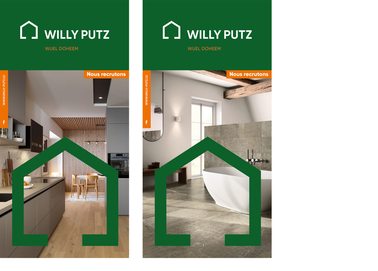
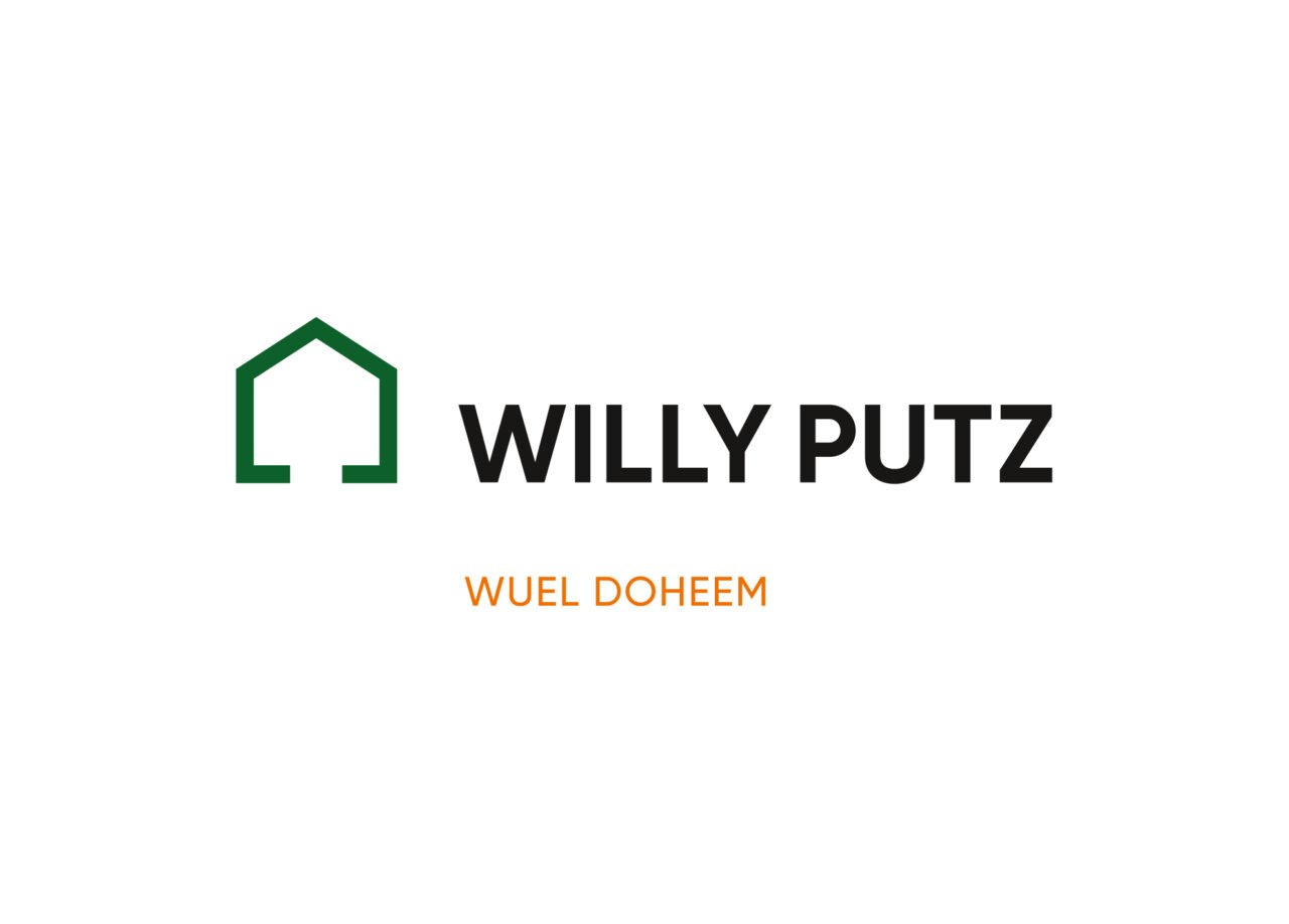
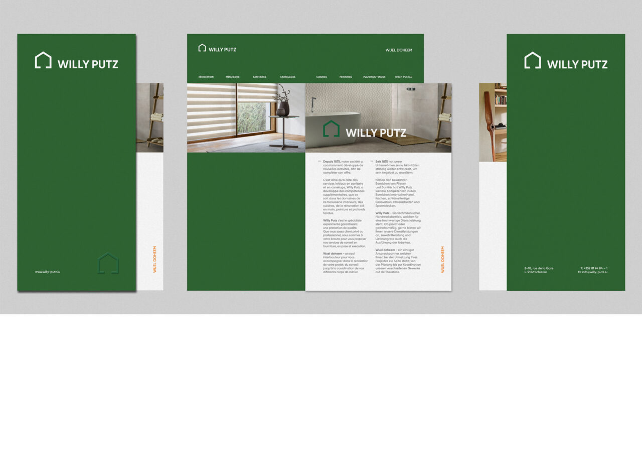
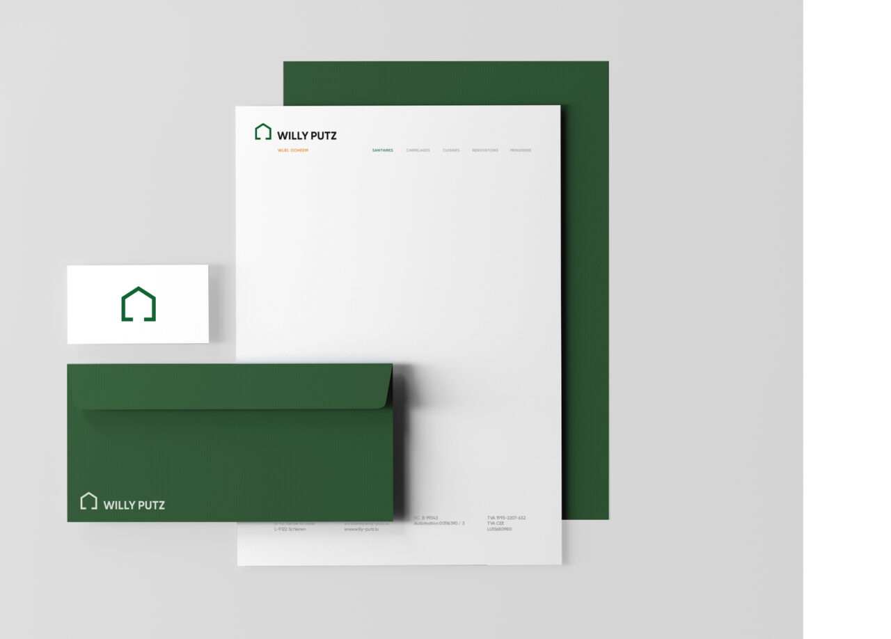
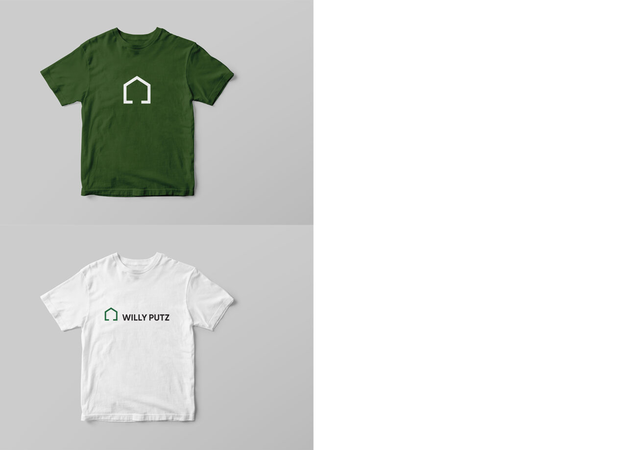
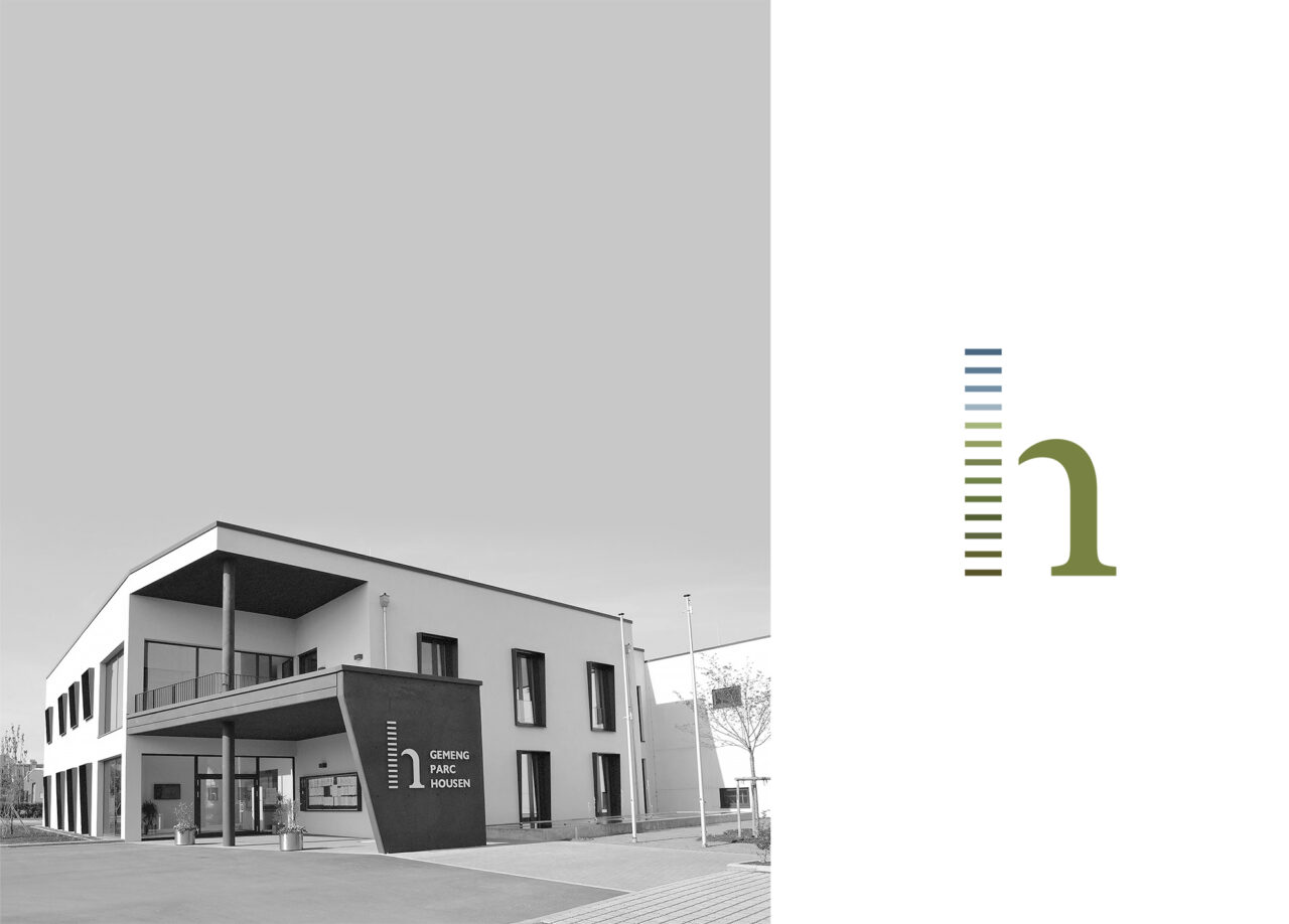
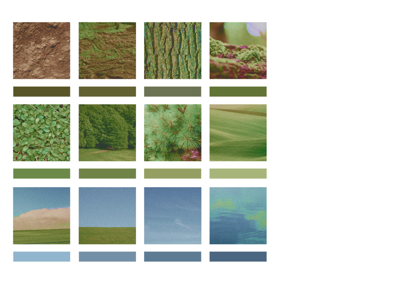
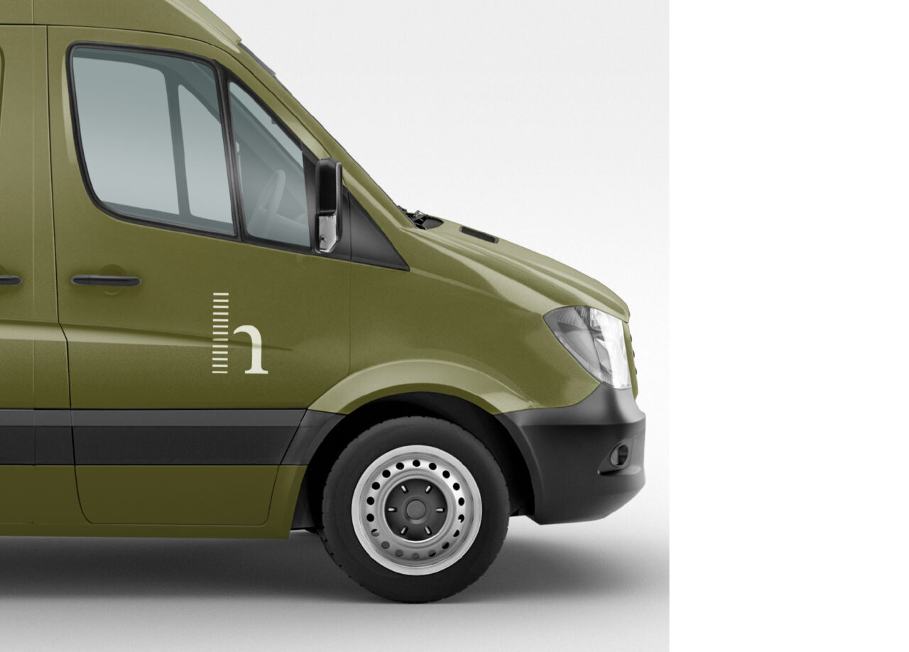
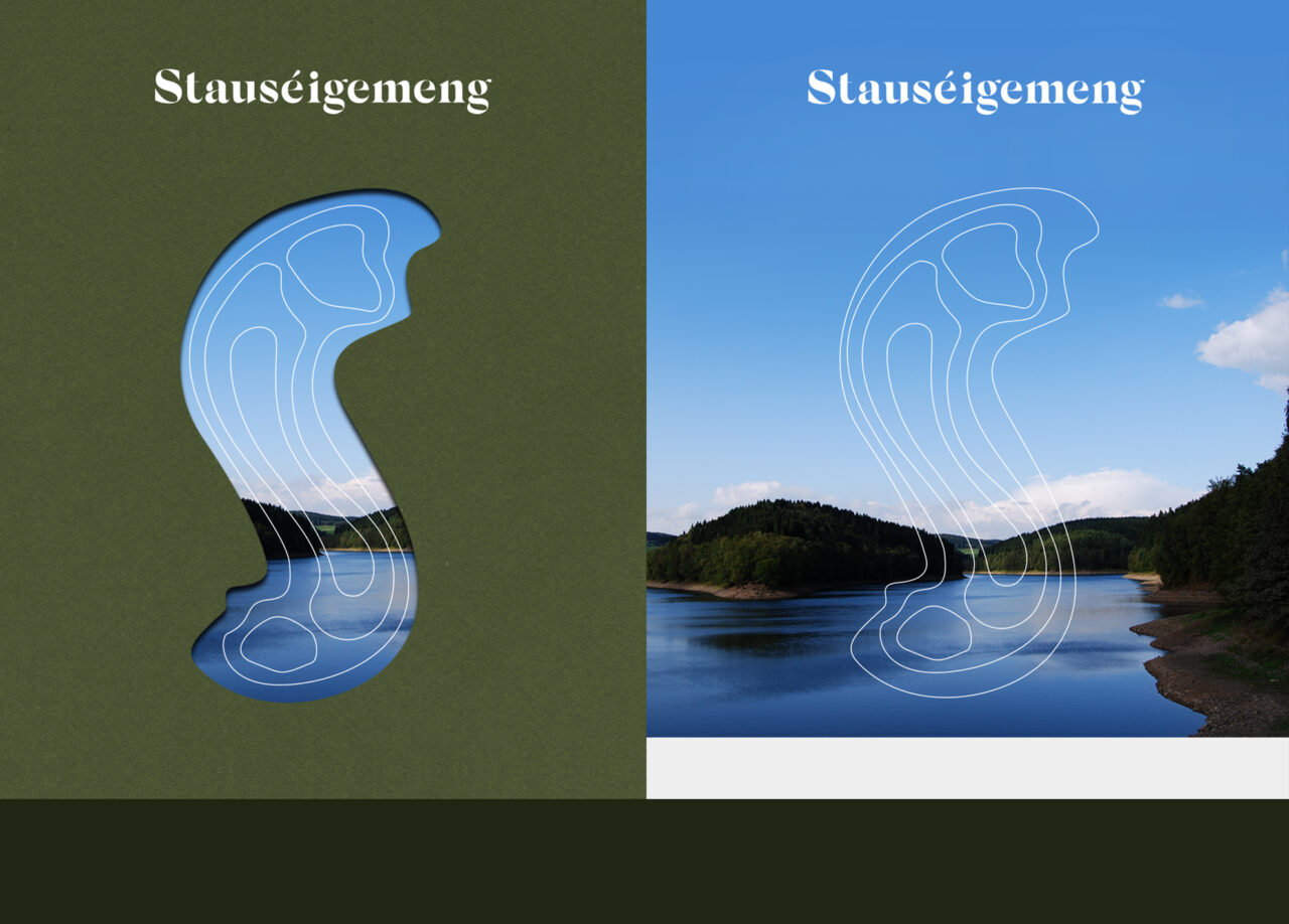
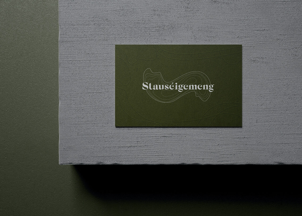
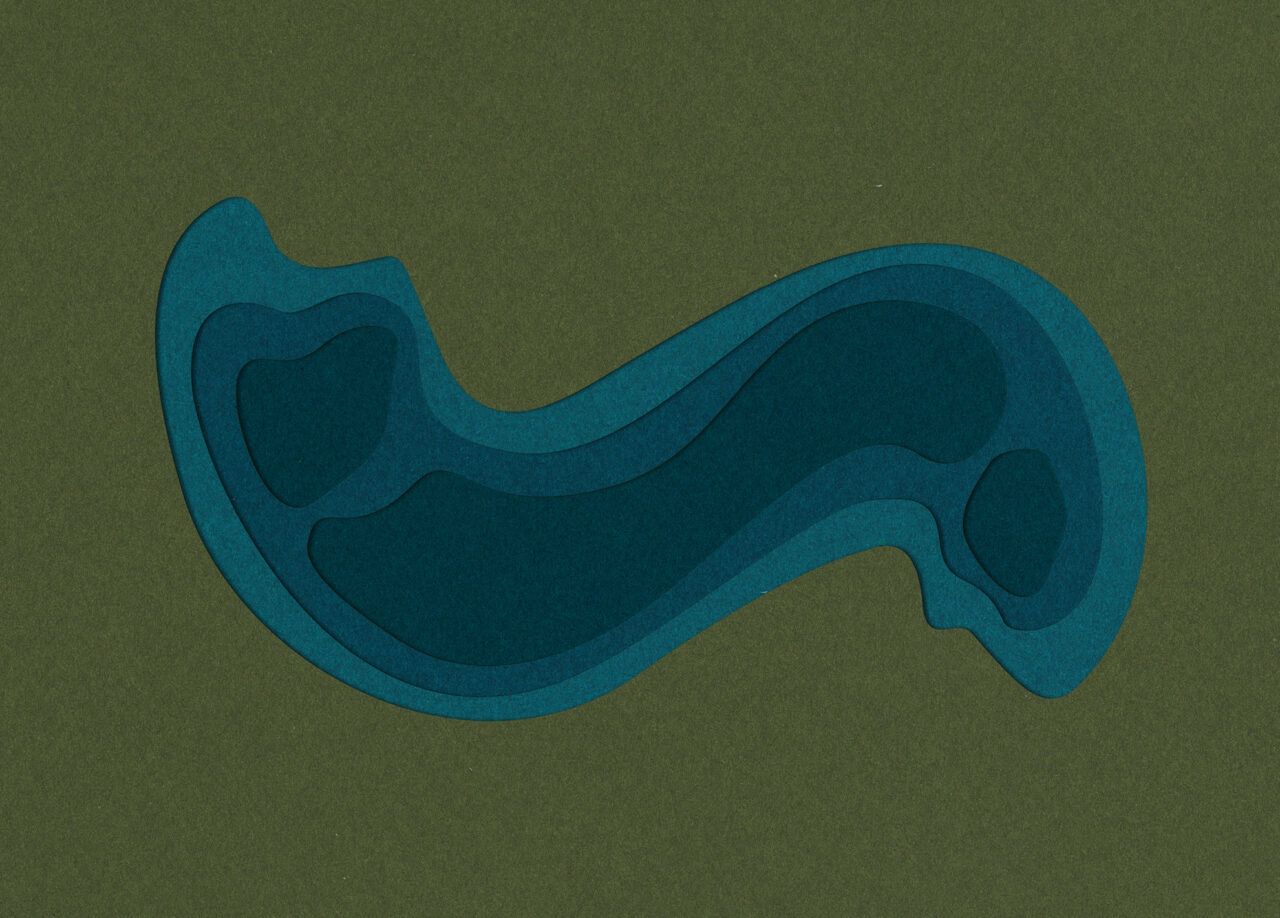
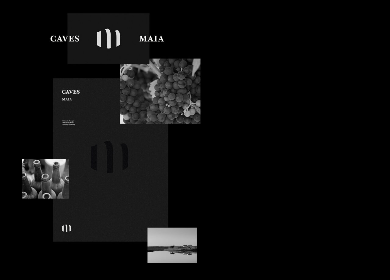
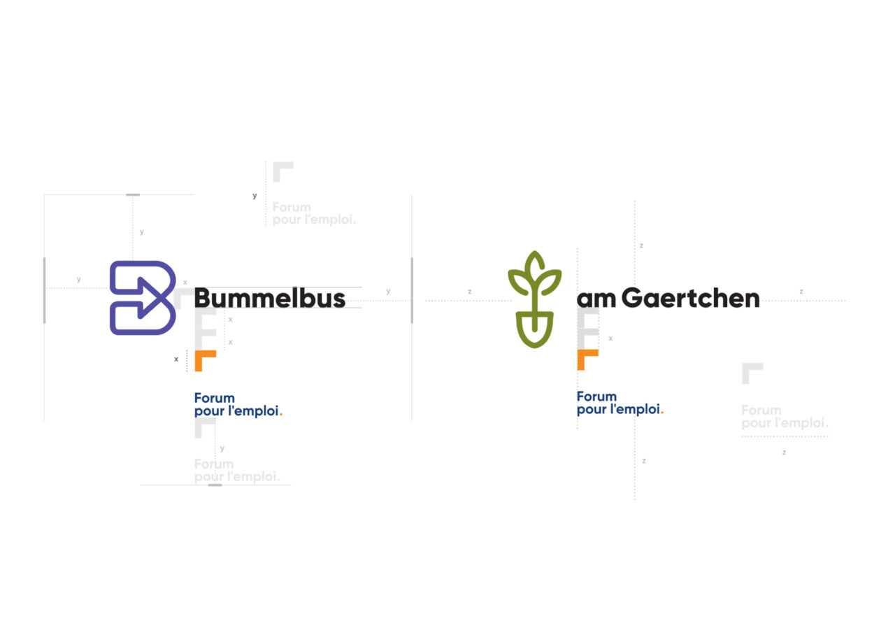
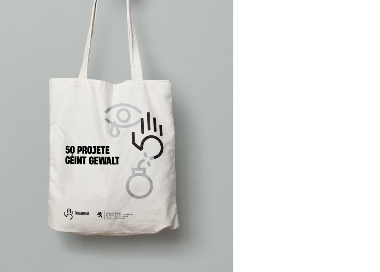
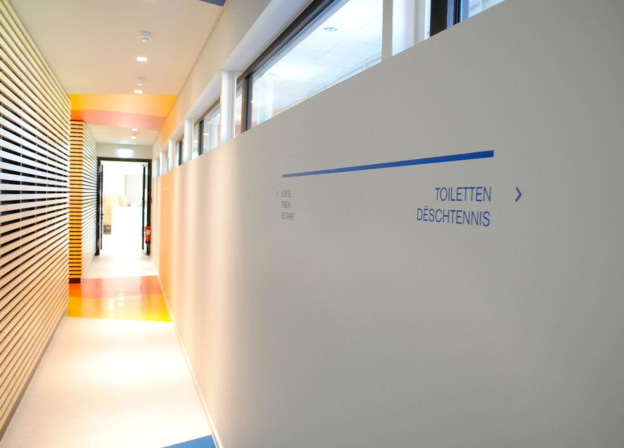
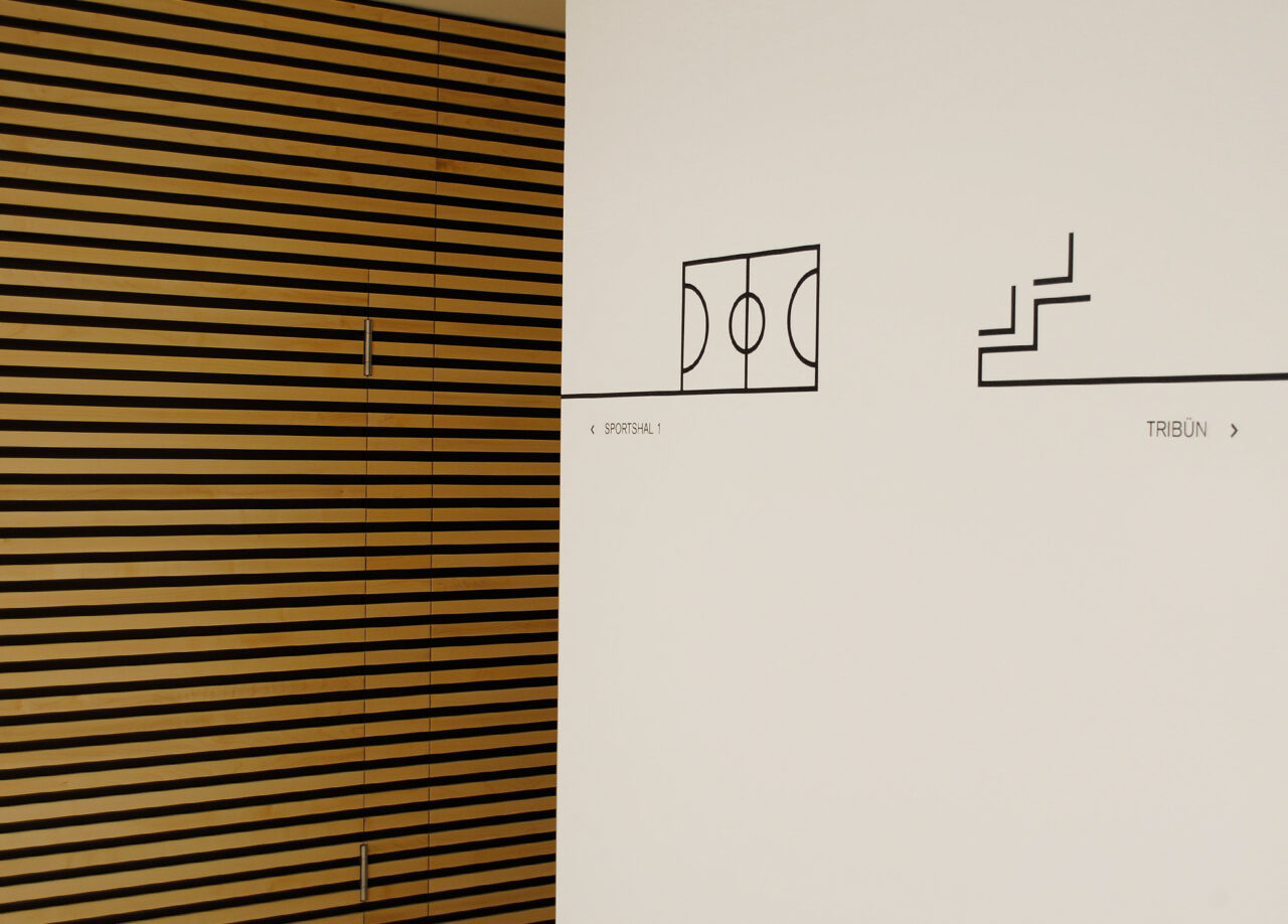
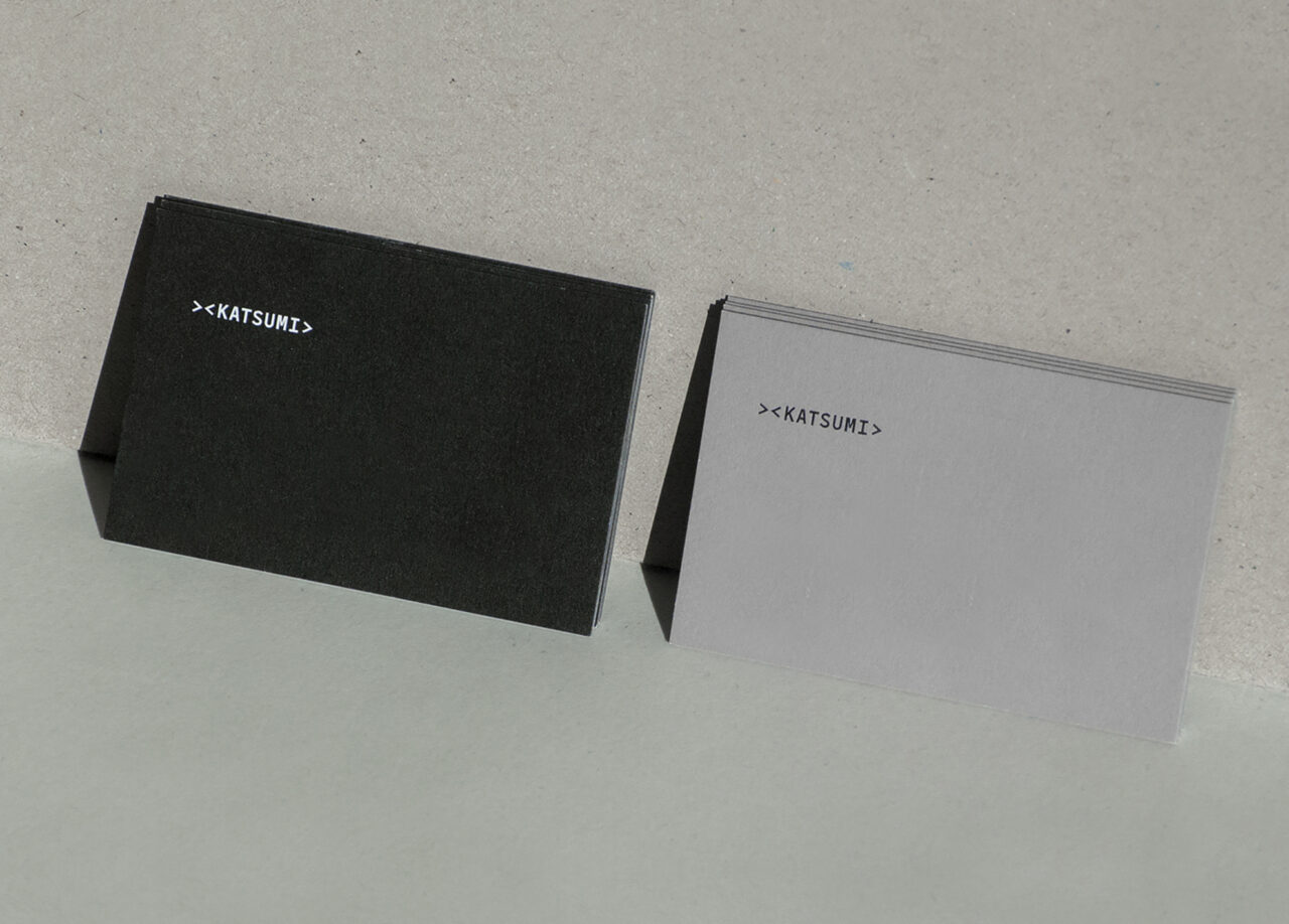
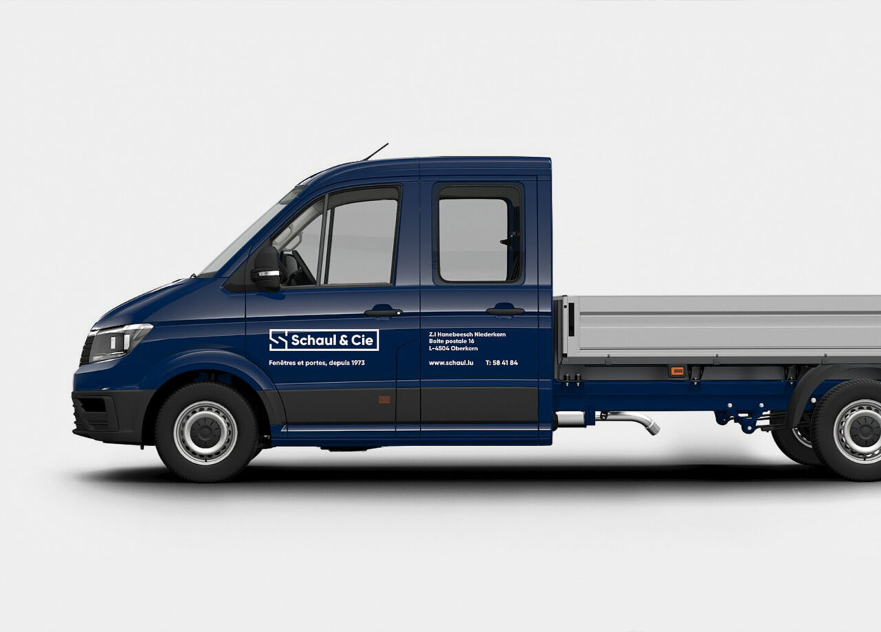
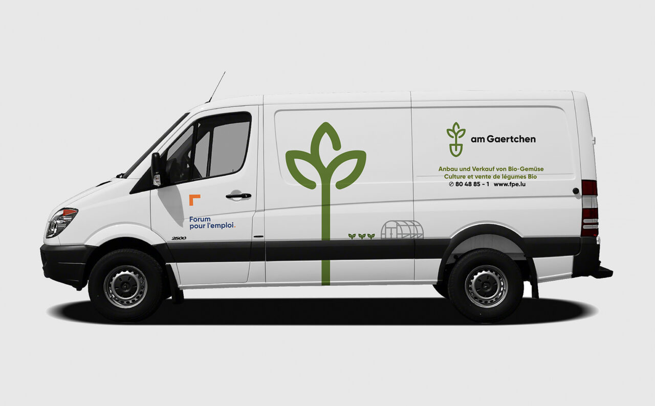
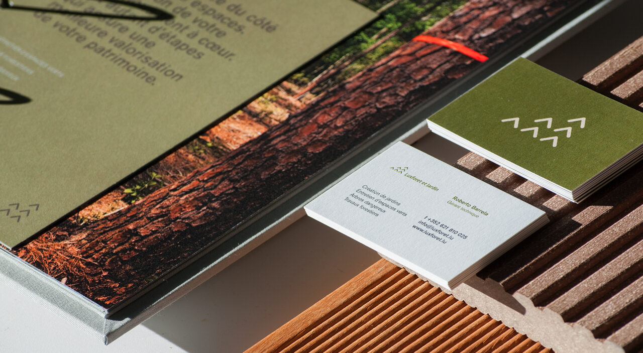
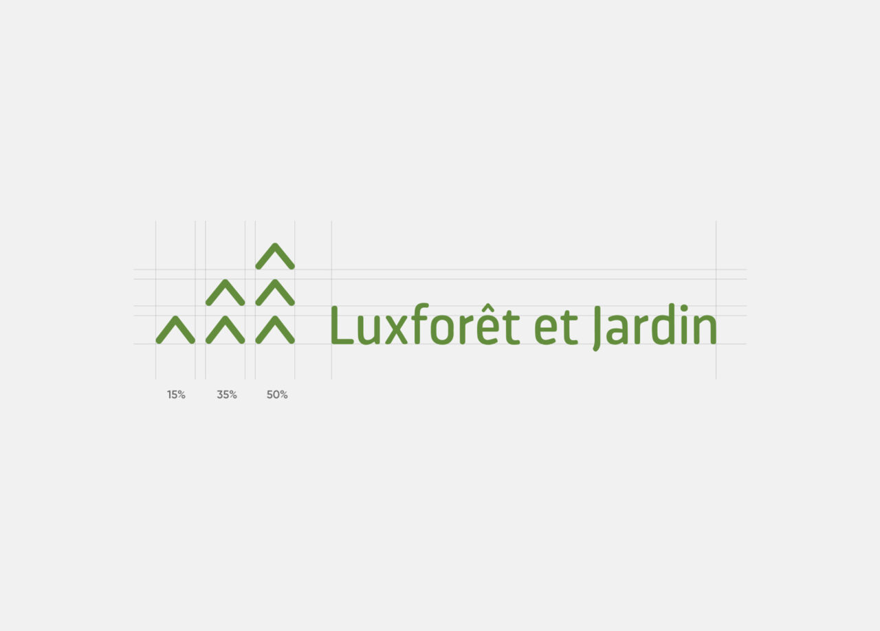
Branding
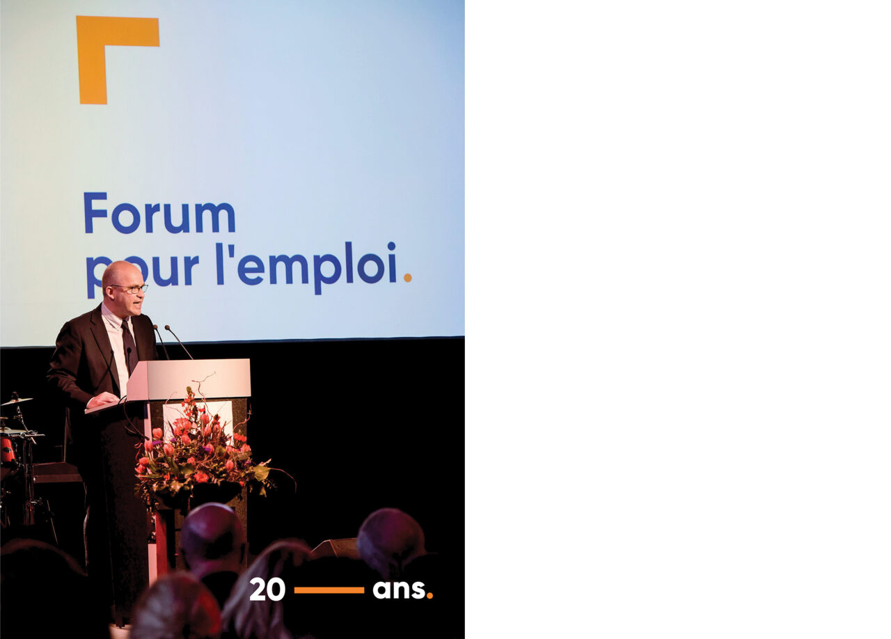
Through elaborated strategies, we create lasting impressions and develop unique marketing concepts to reach the target audiences. A great brand is one that creates emotional and valuable experiences for its customers.
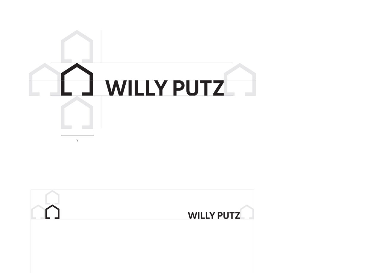
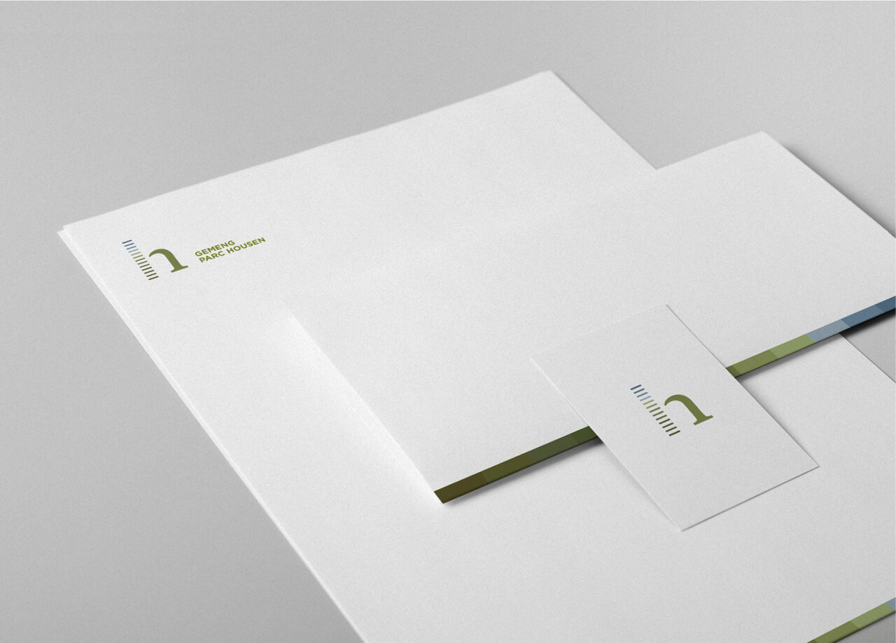
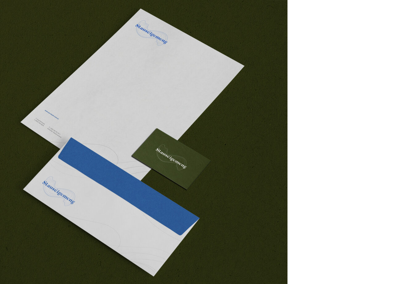
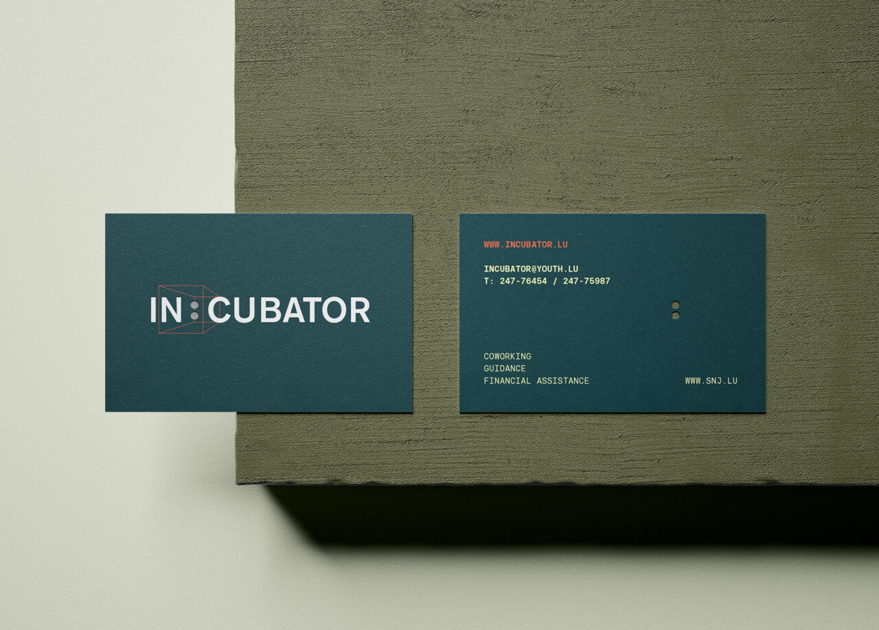
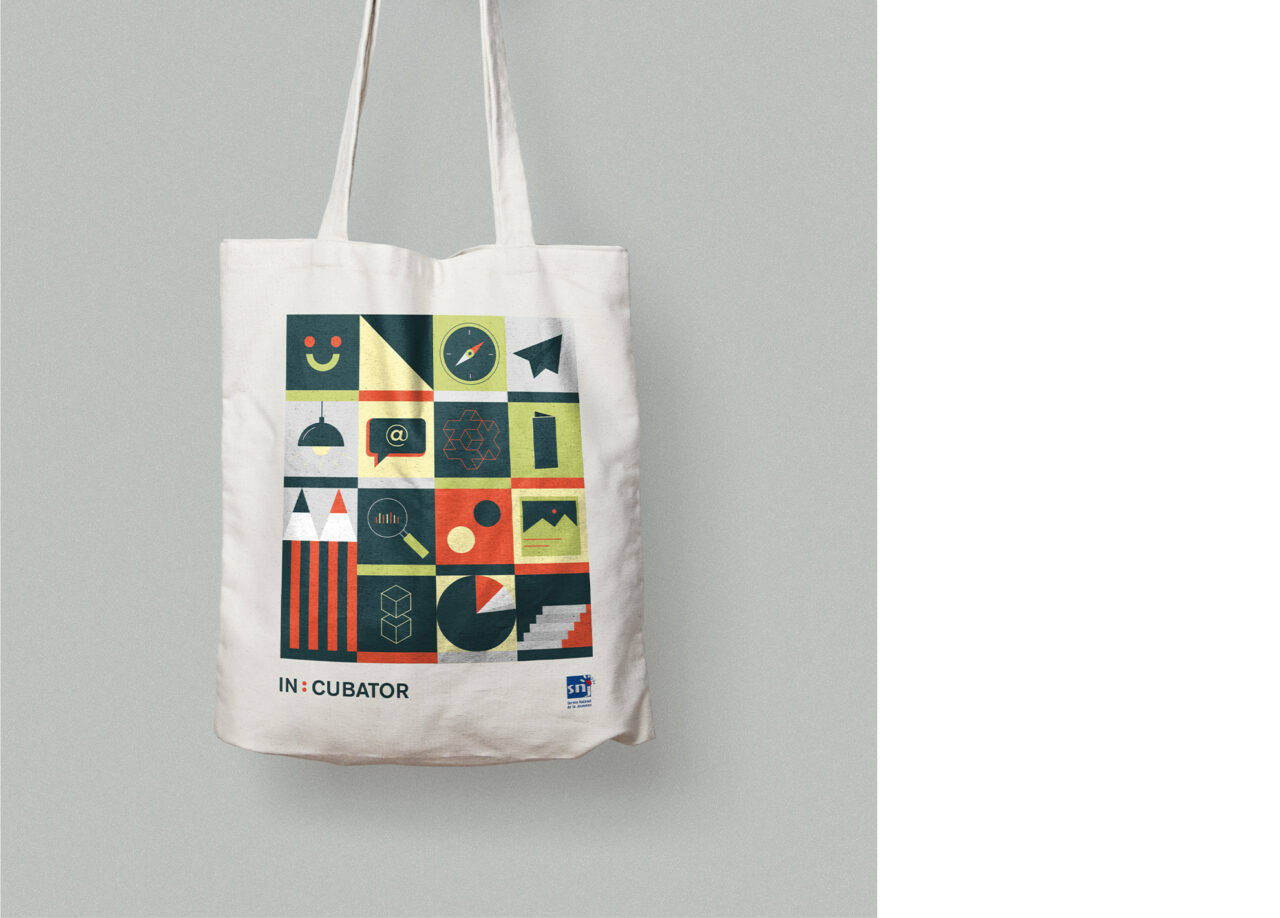
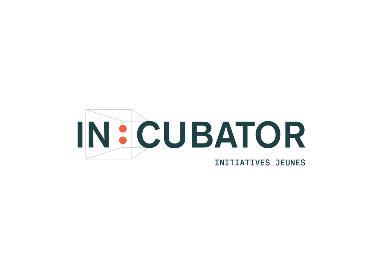
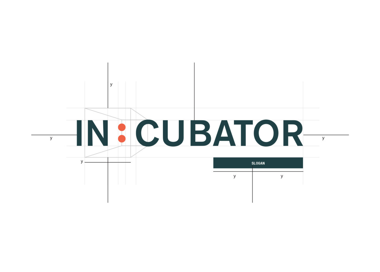
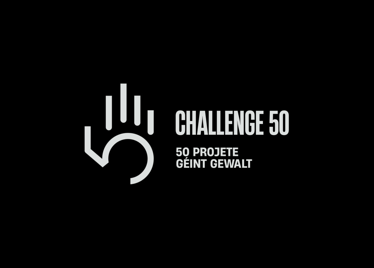
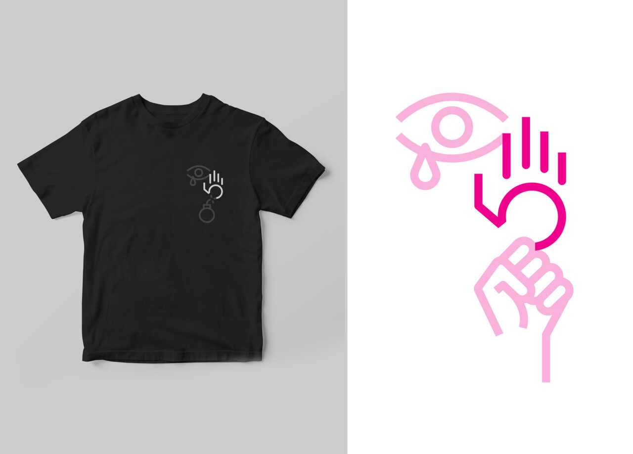
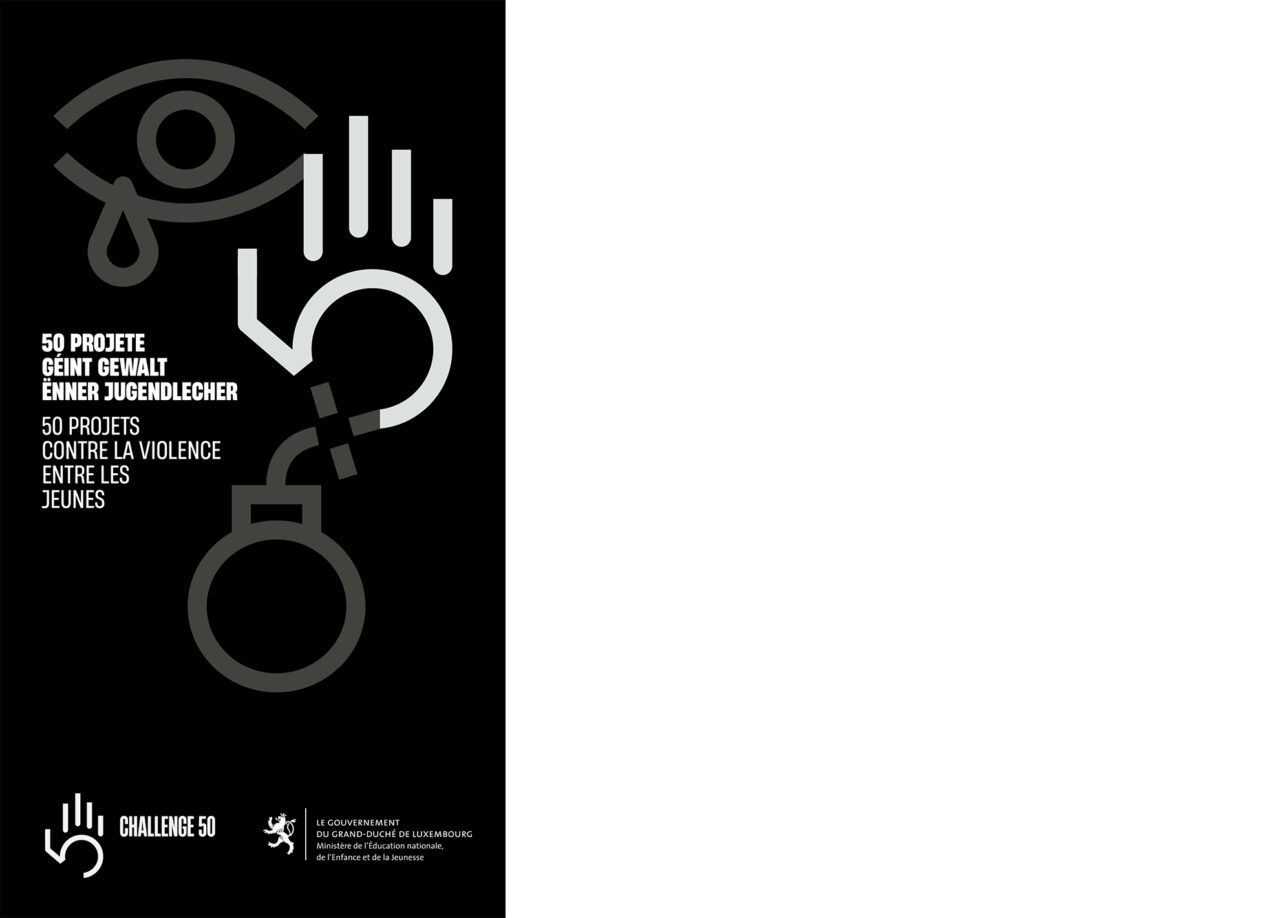
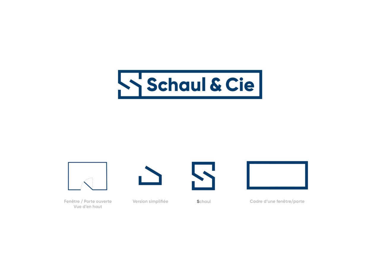
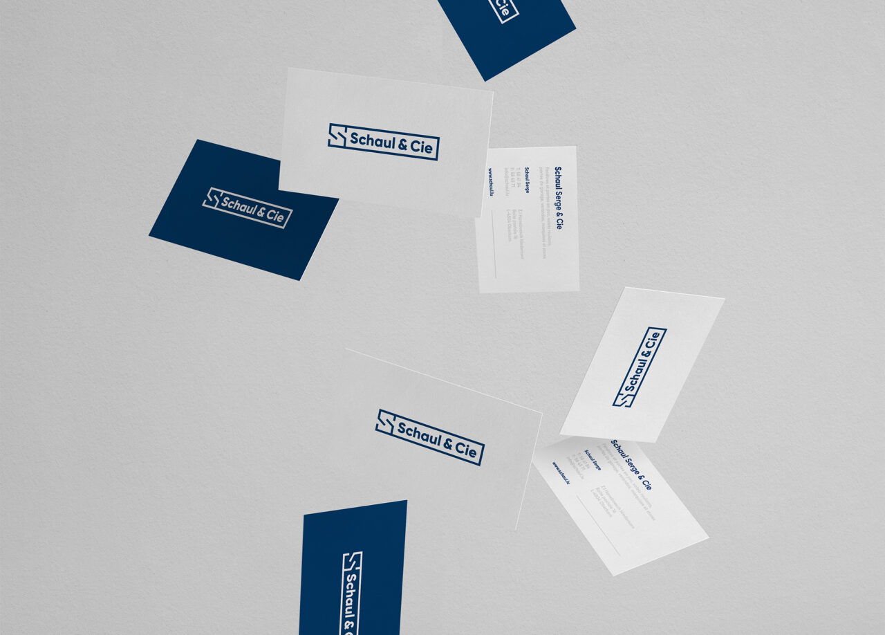
Visual identities and logos
Design and marketing strategy
Corporate identity
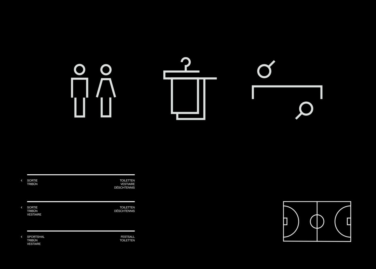
Design guidelines
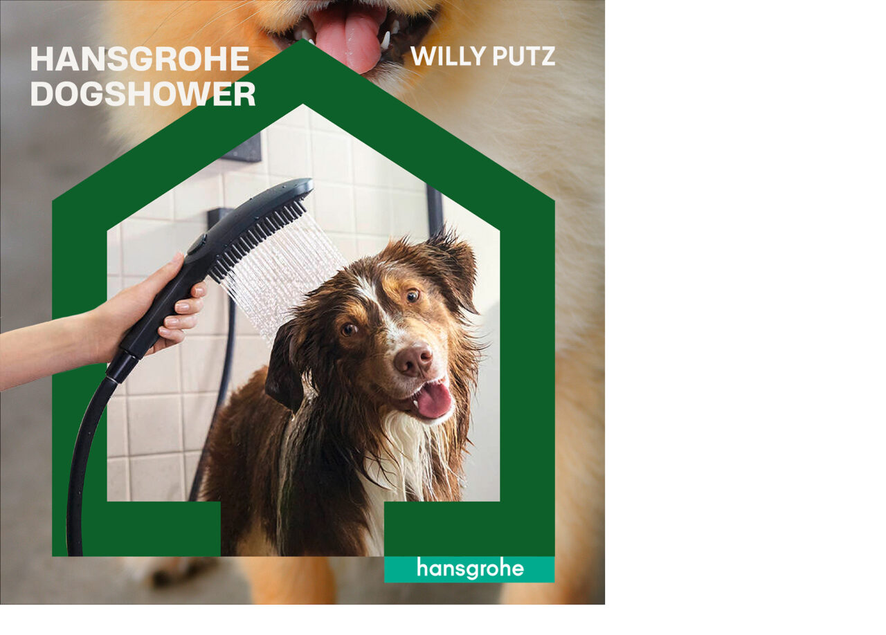
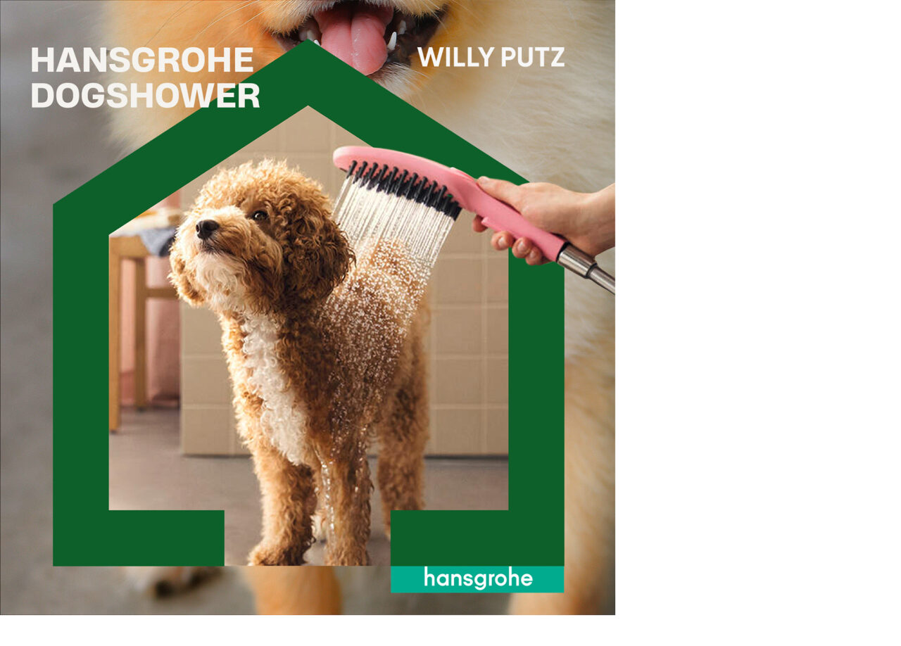
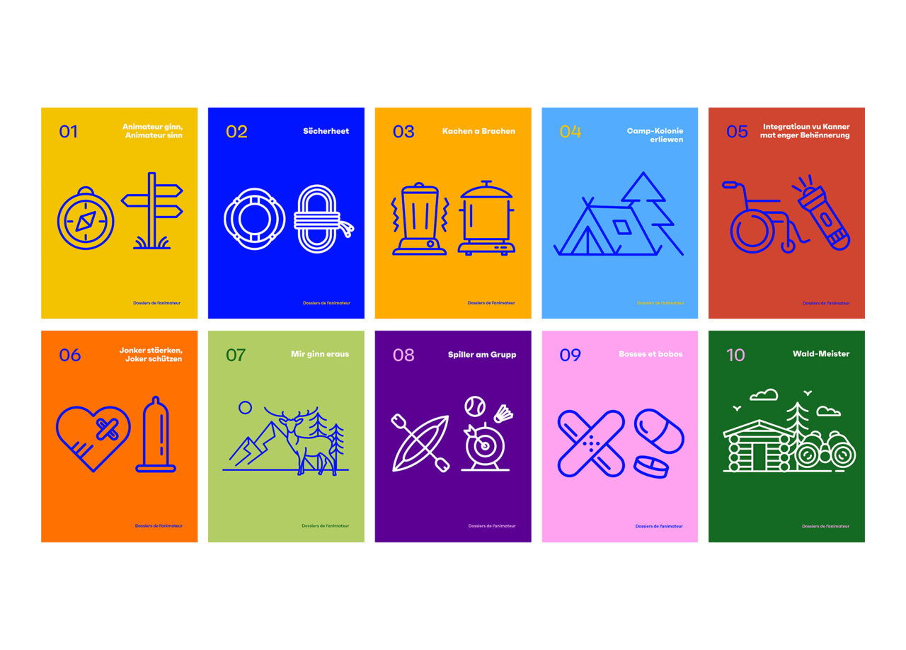
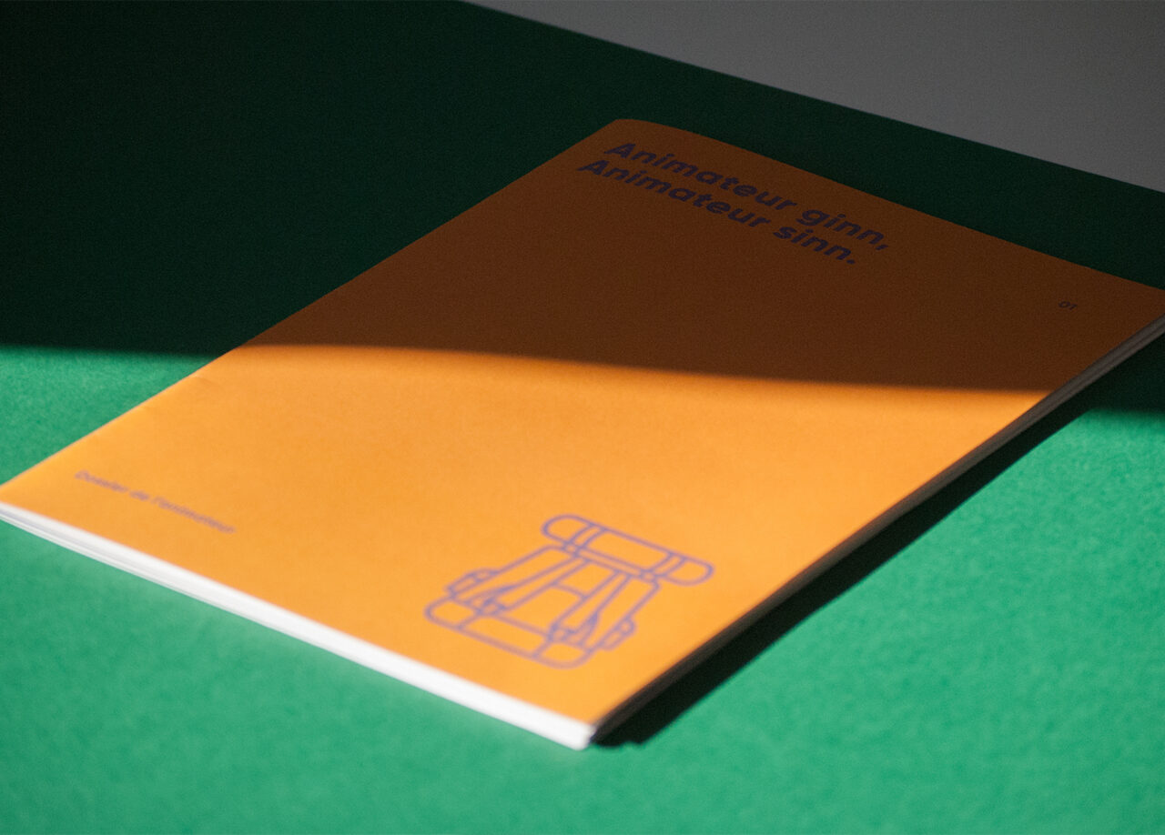
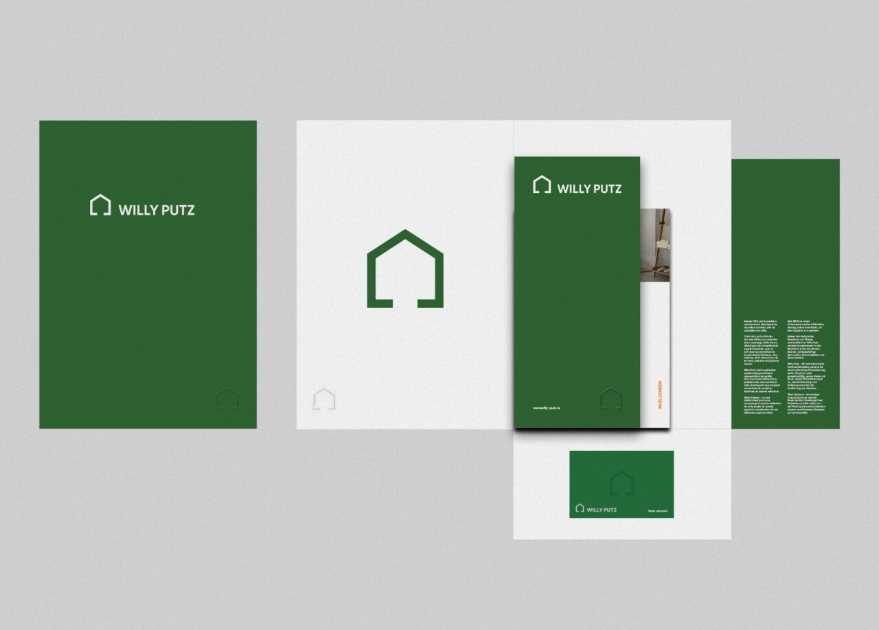
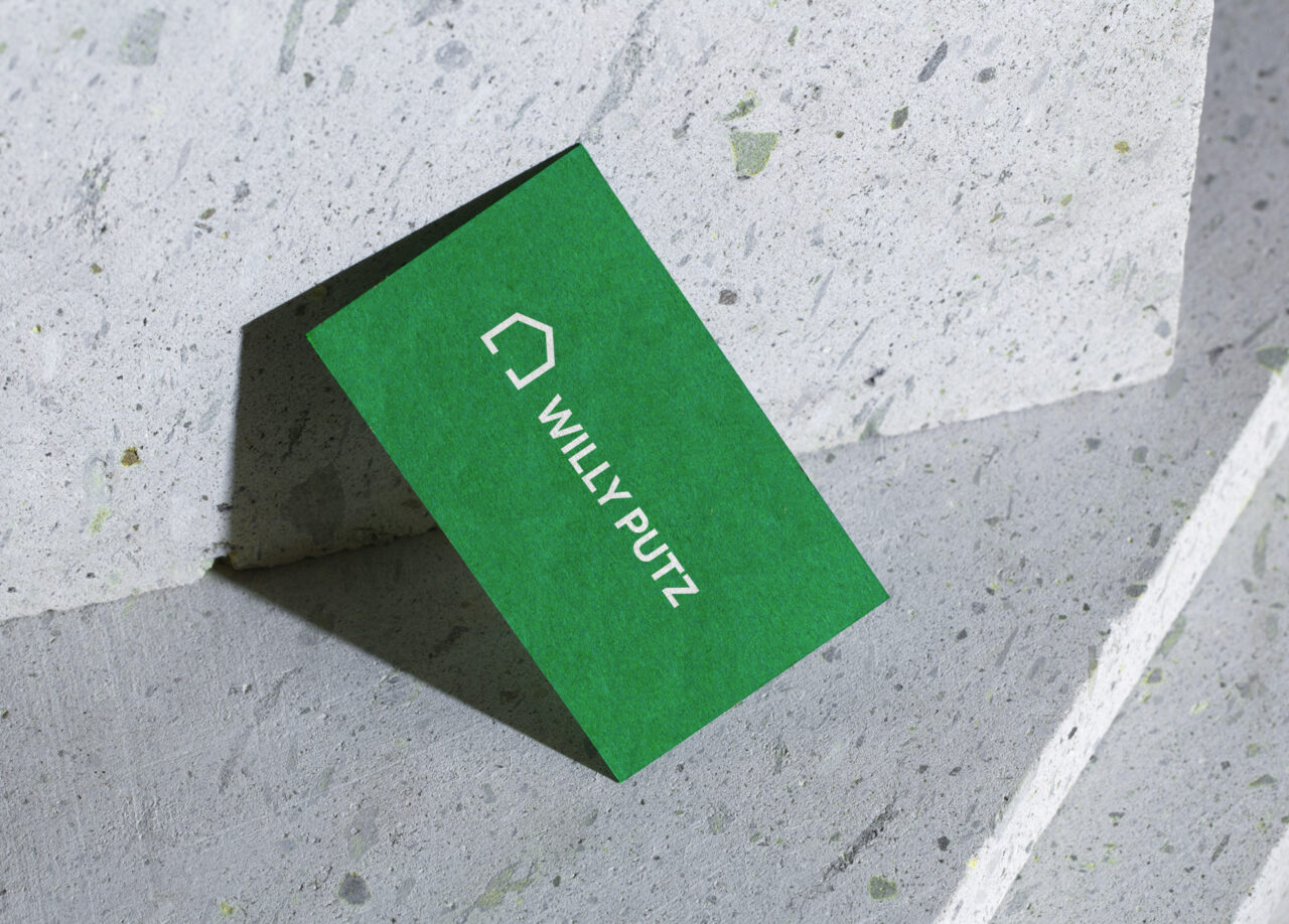
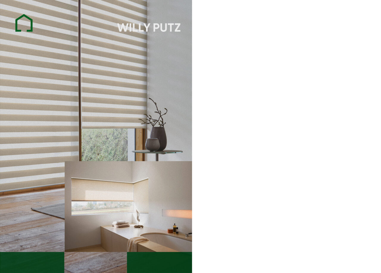
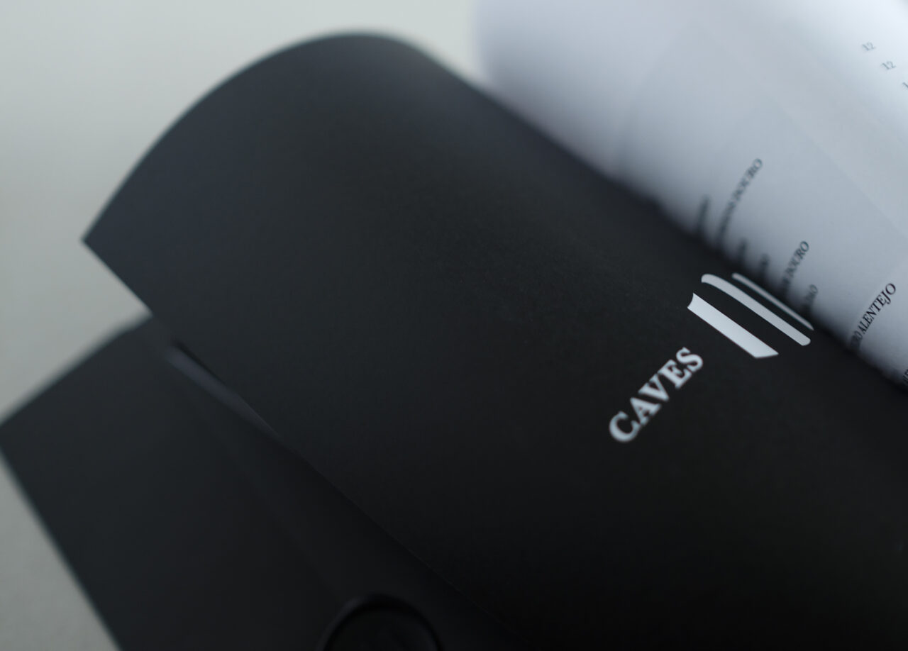
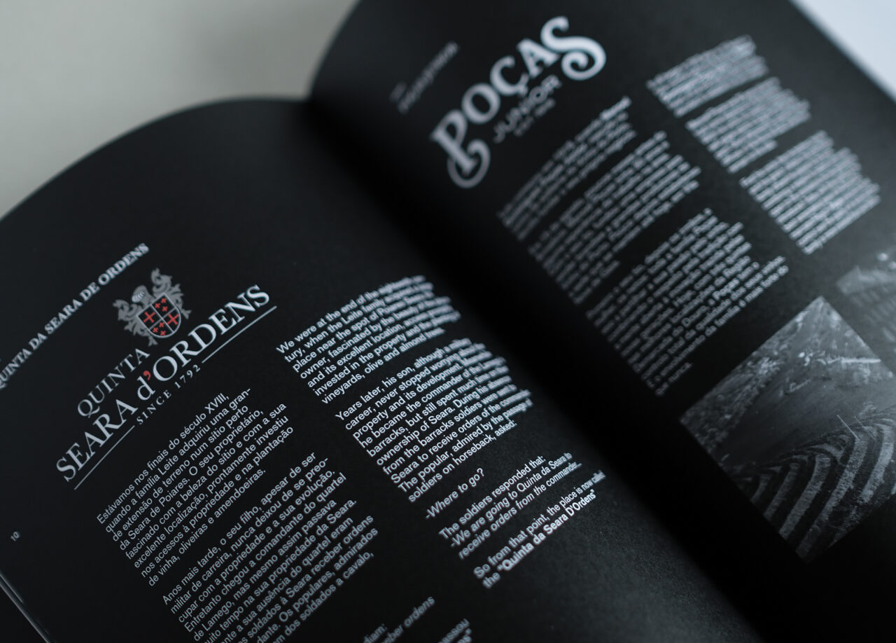
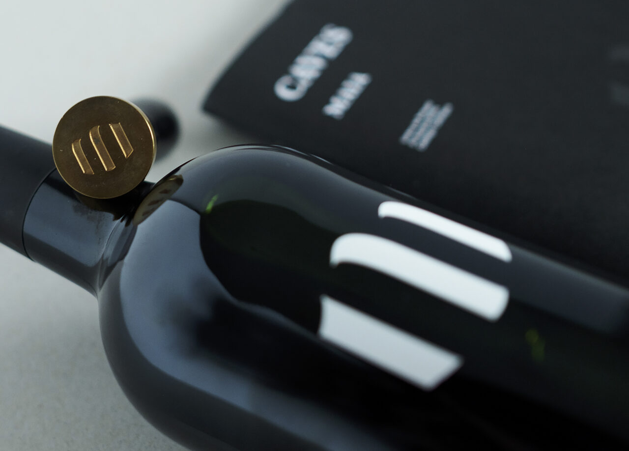
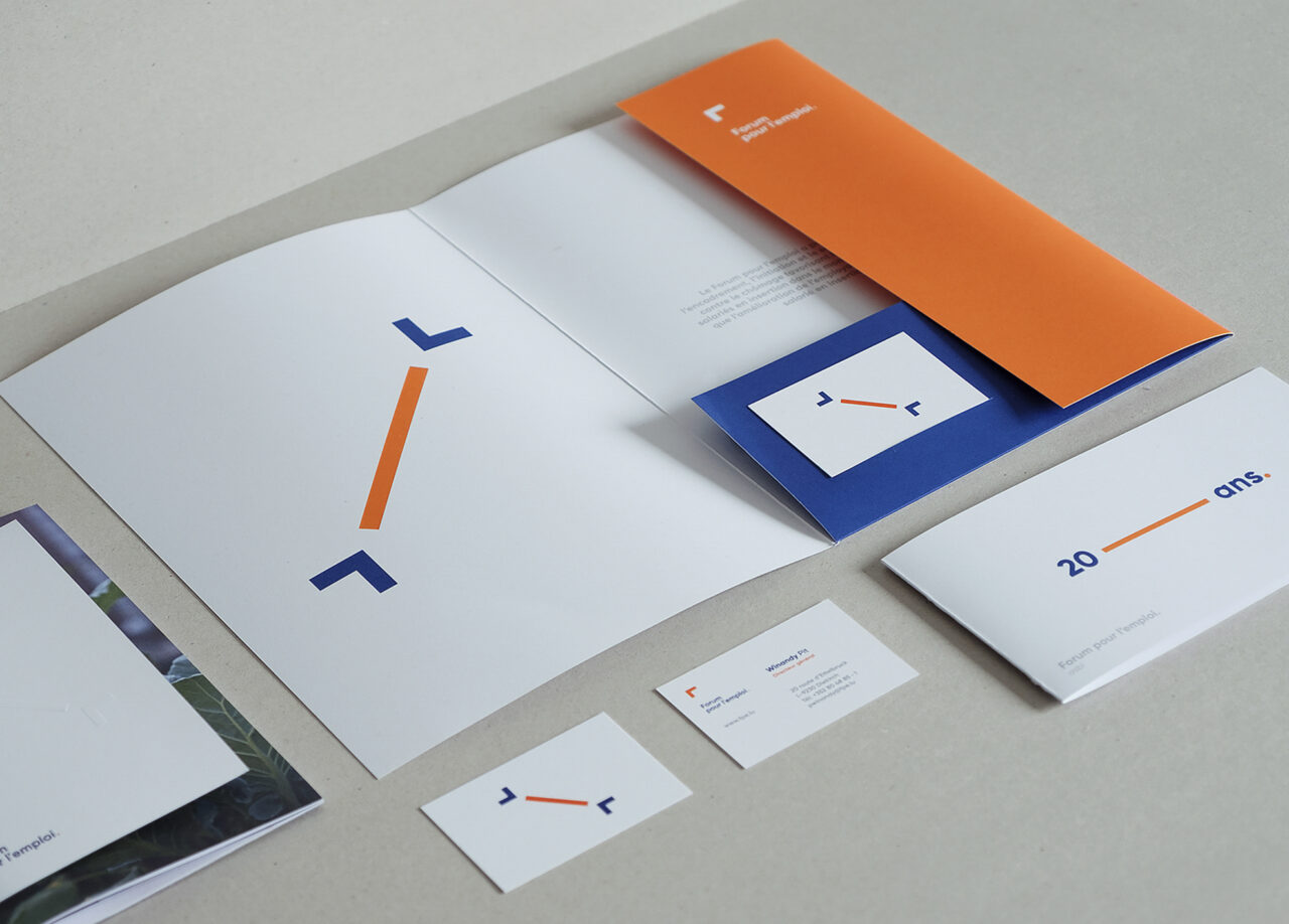
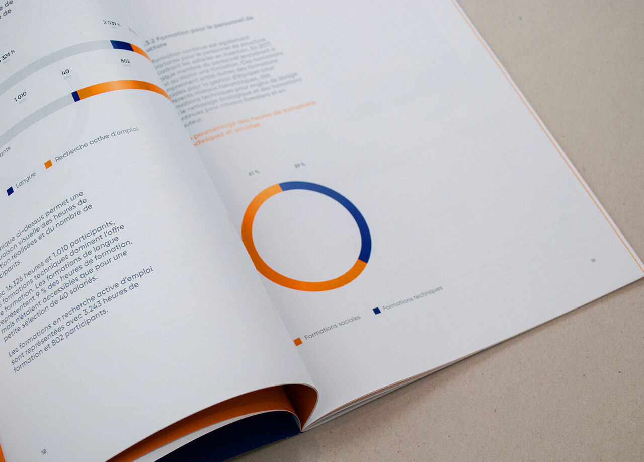
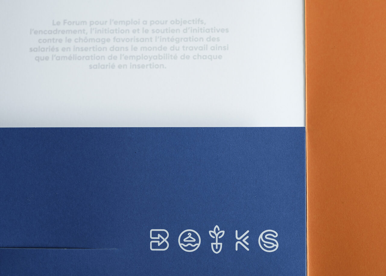
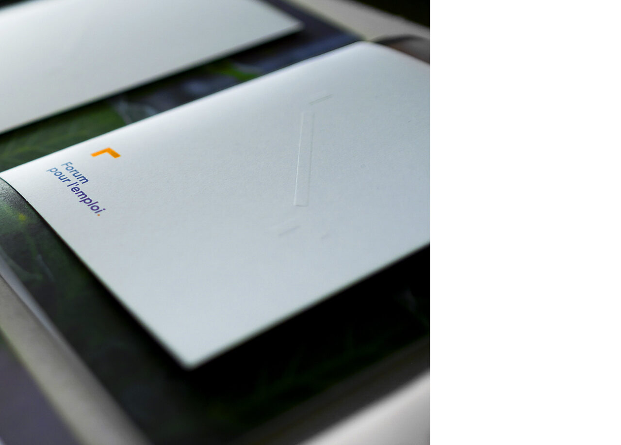
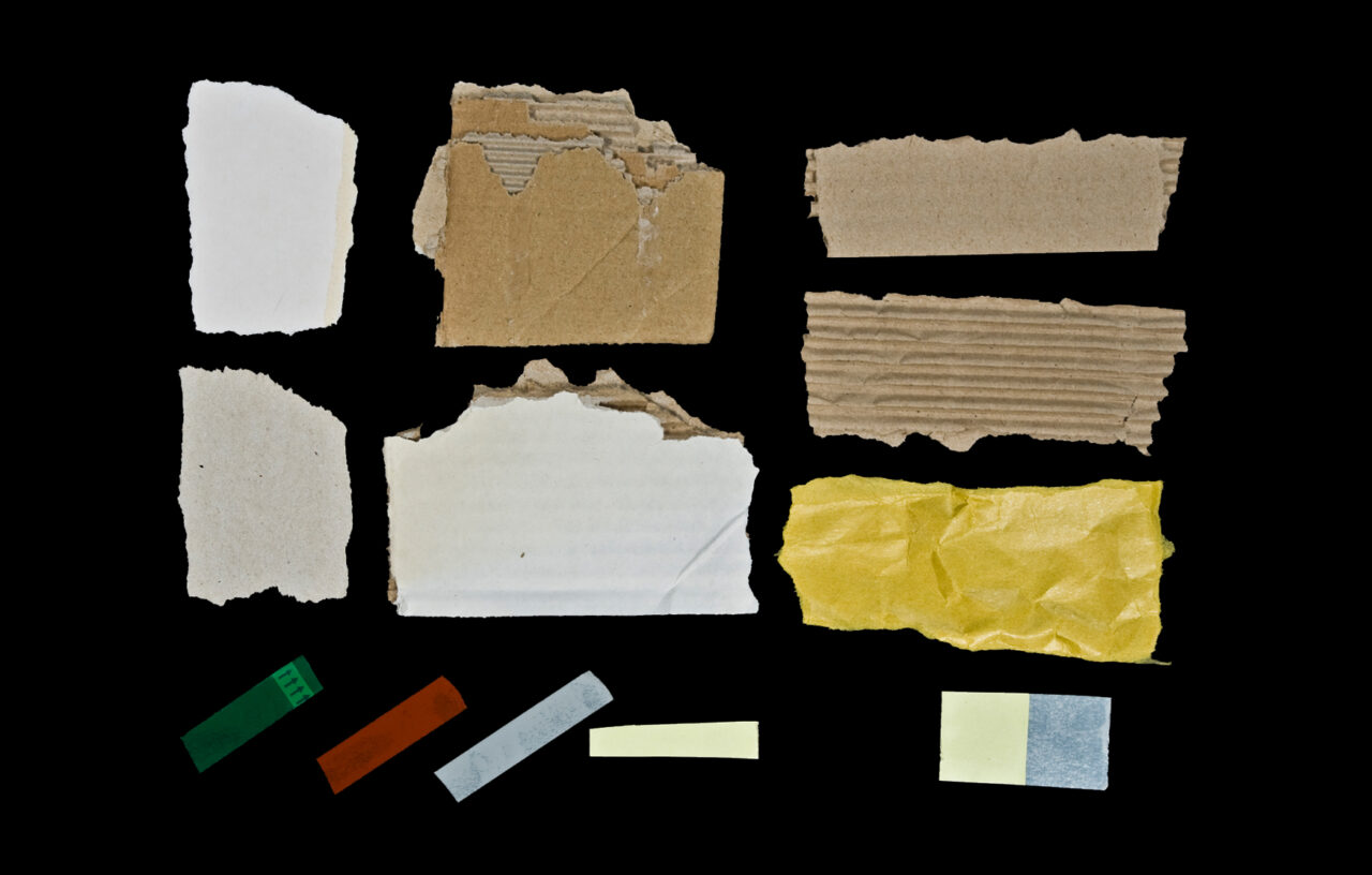
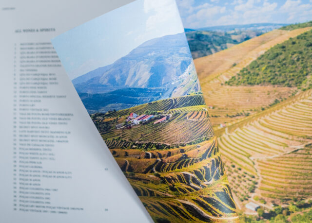
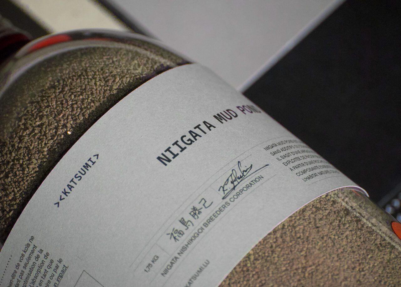
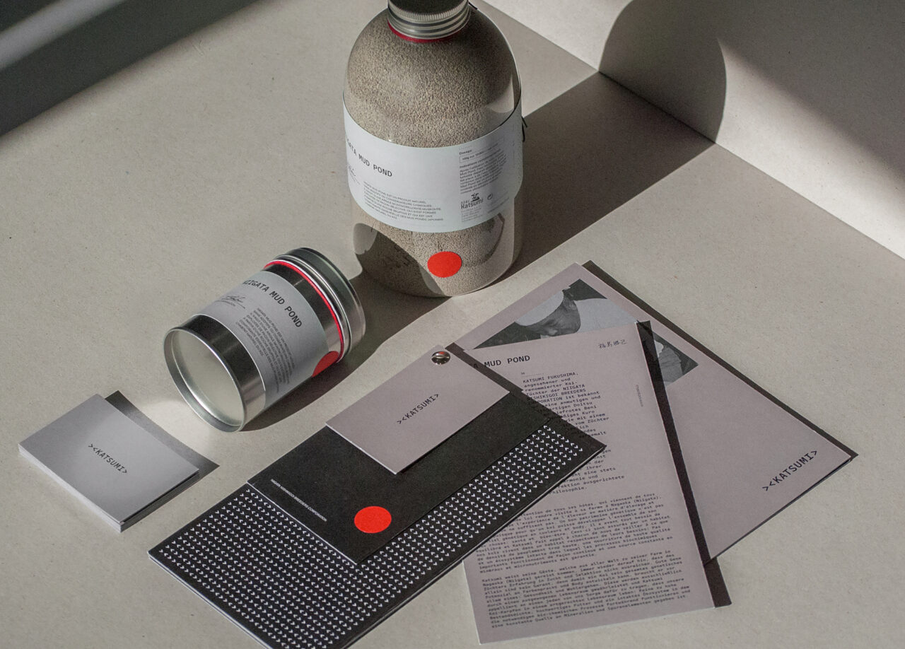
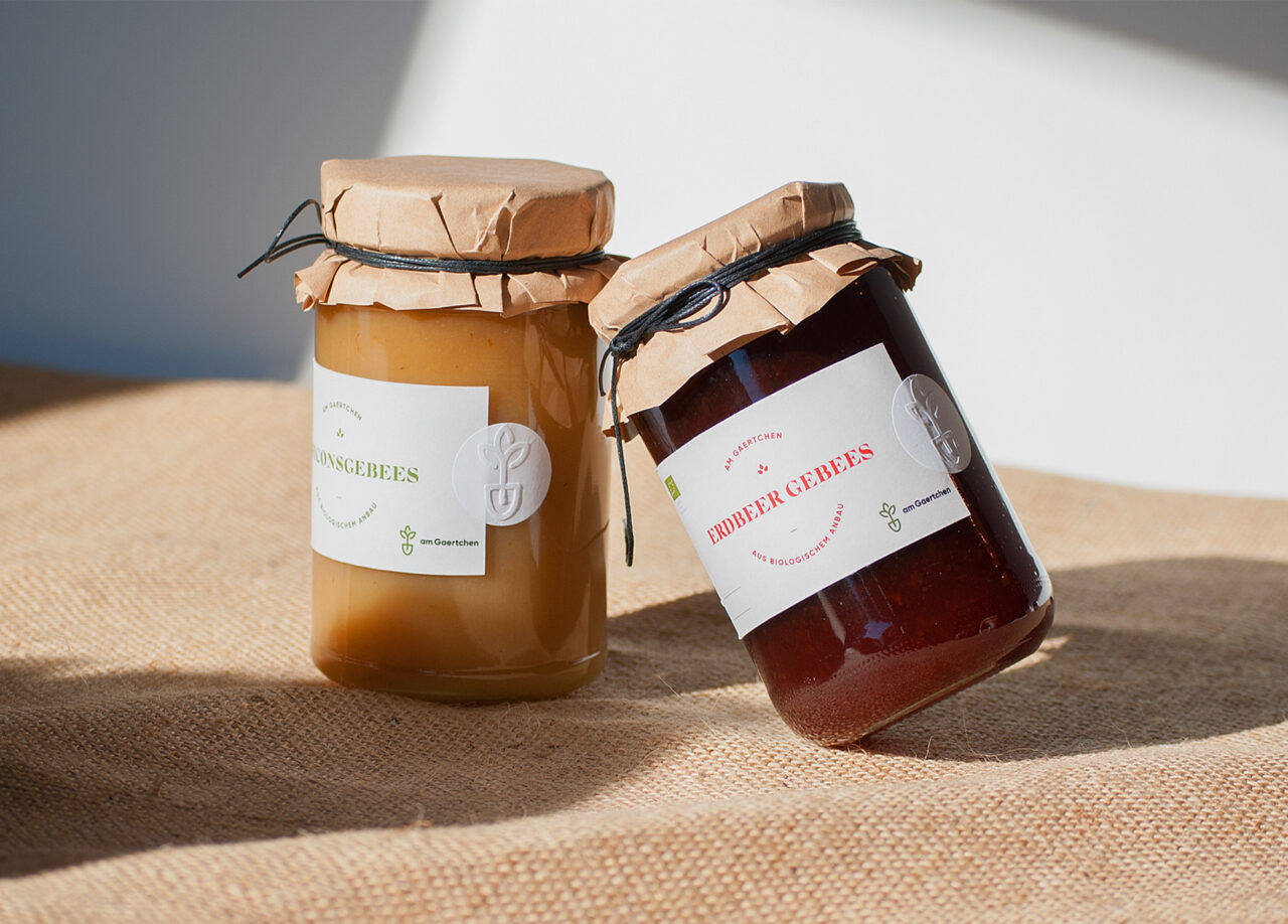
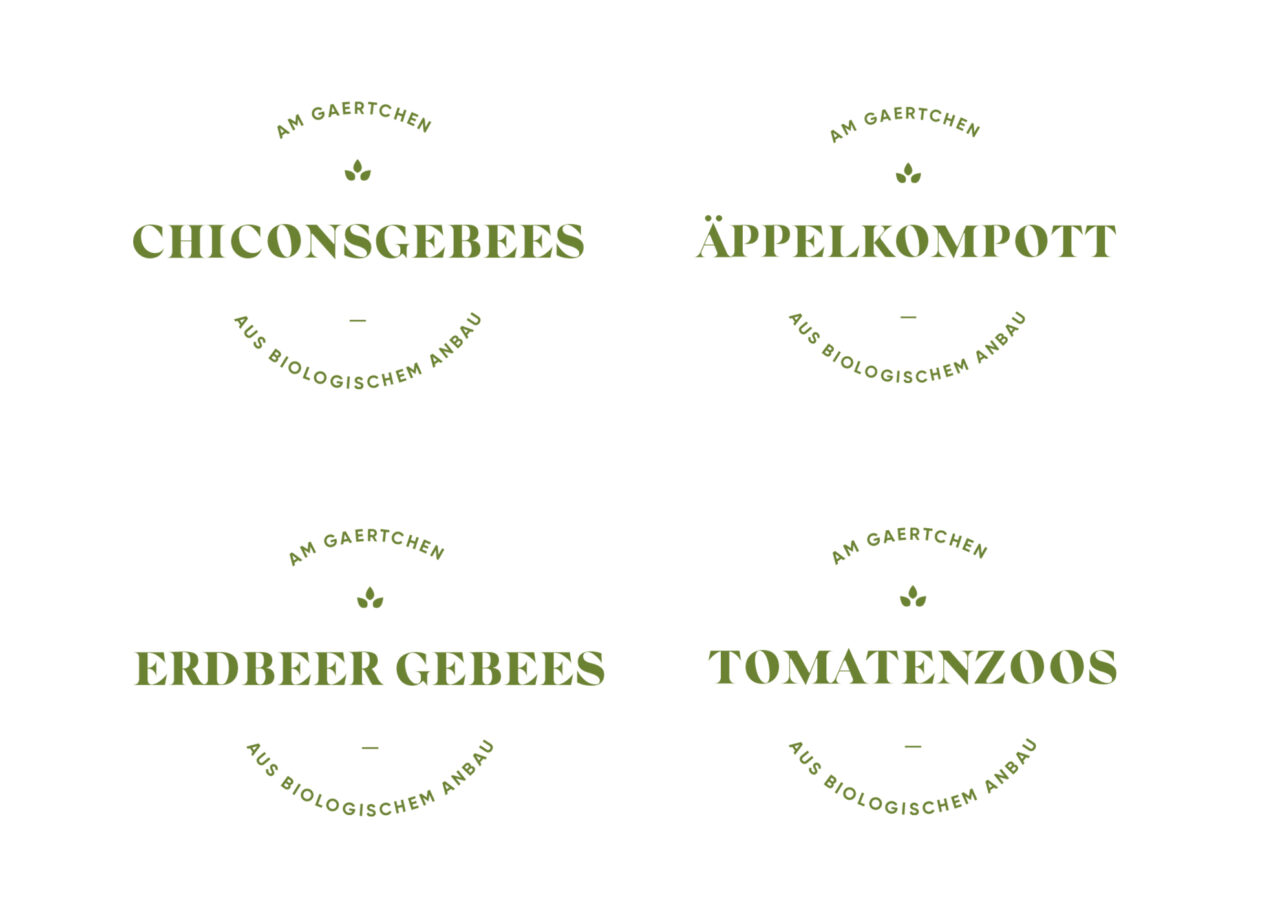
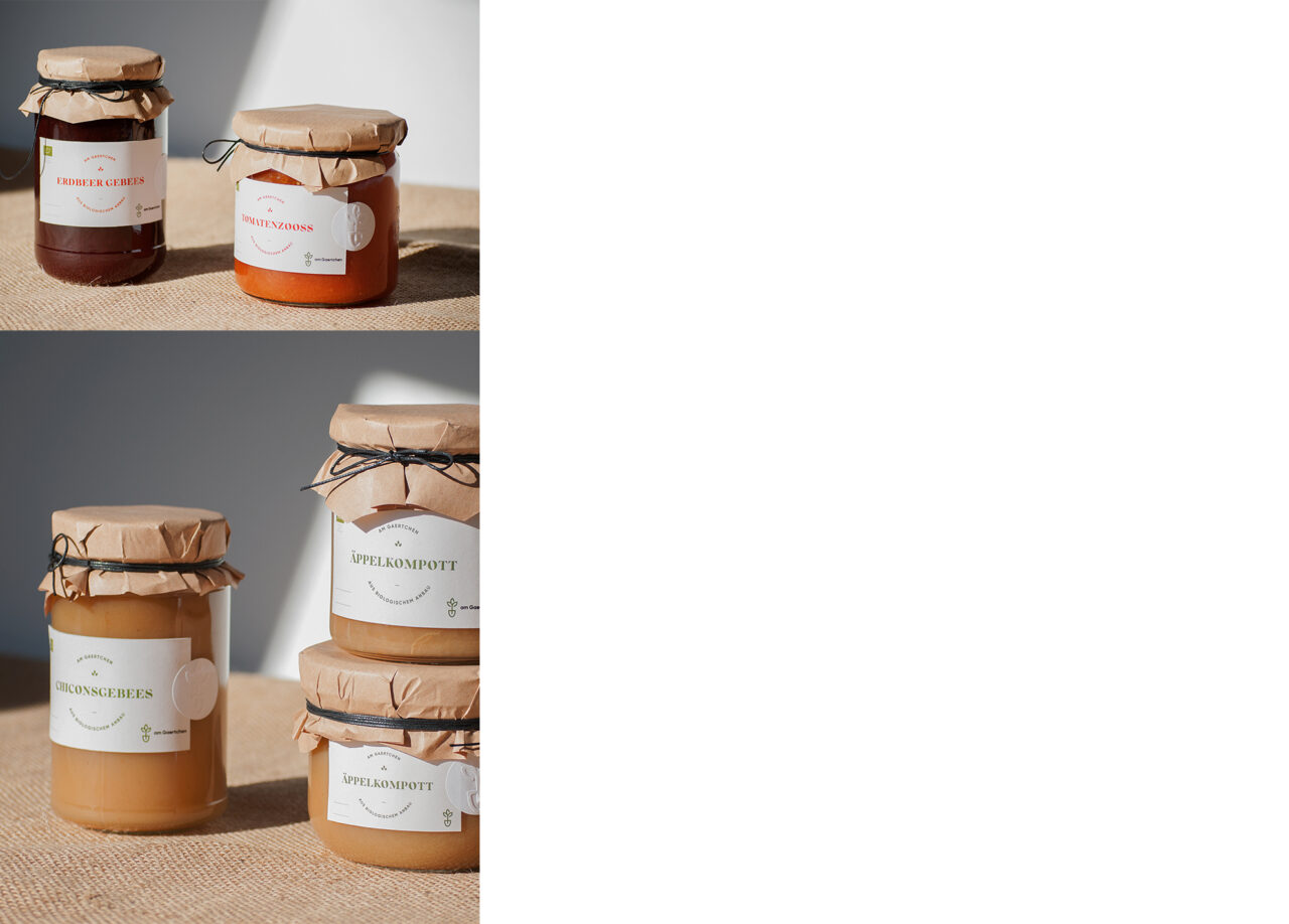
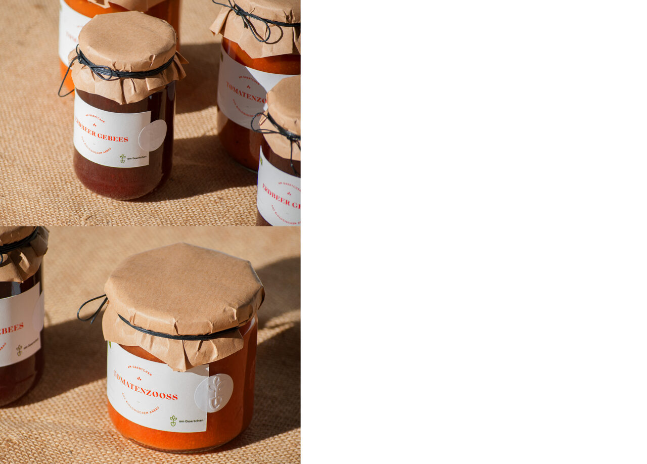
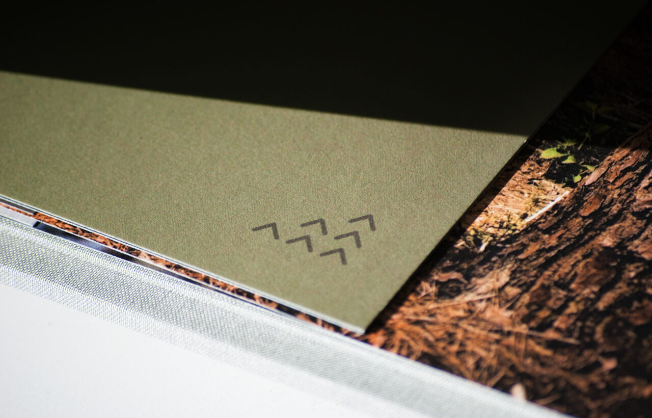
Paper is the perfect medium for graphic design: we create clear messages and beautiful stories which are printed with quality and finesse. The success of editorial and packaging design depends on clear communication and consist story telling, both of which demand detailed applications of grid layouts and the establishment of visual hierarchies in order to keep readers entertained while they consume the content.
Editorial
Packaging
Book design
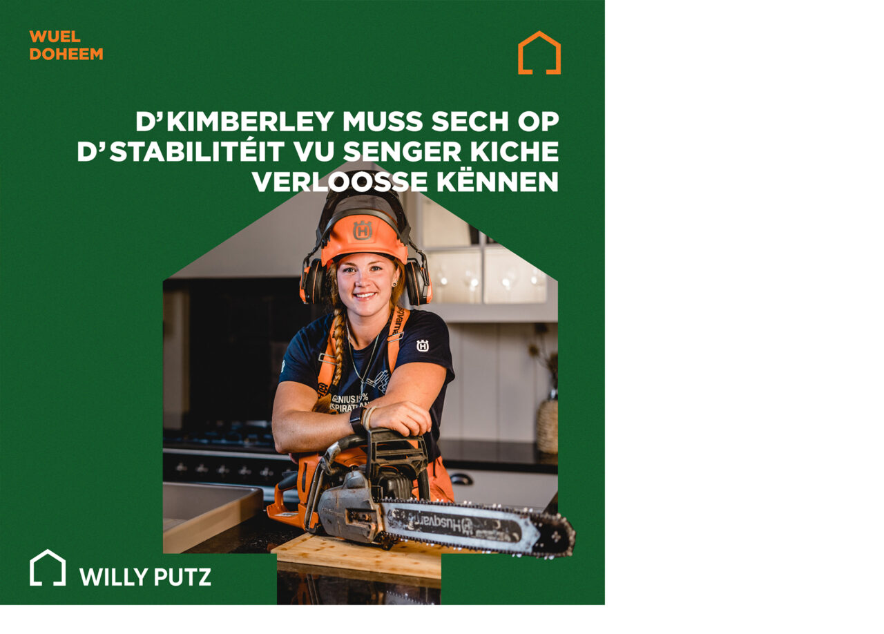
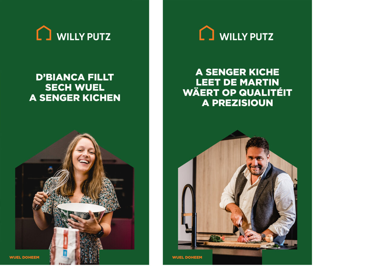
Campaigns
Annual reports
Art Direction
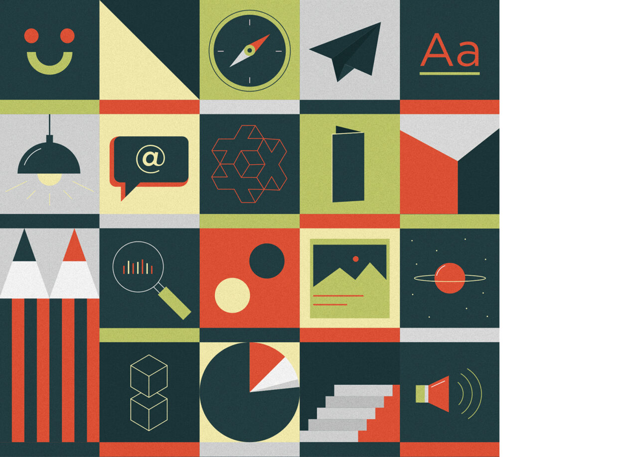
Managing any type of artistic projects, we go further than just offering classic design. As intermediary presence between creatives and clients we help implementing external feedback and assume responsibility by taking the core decisions.
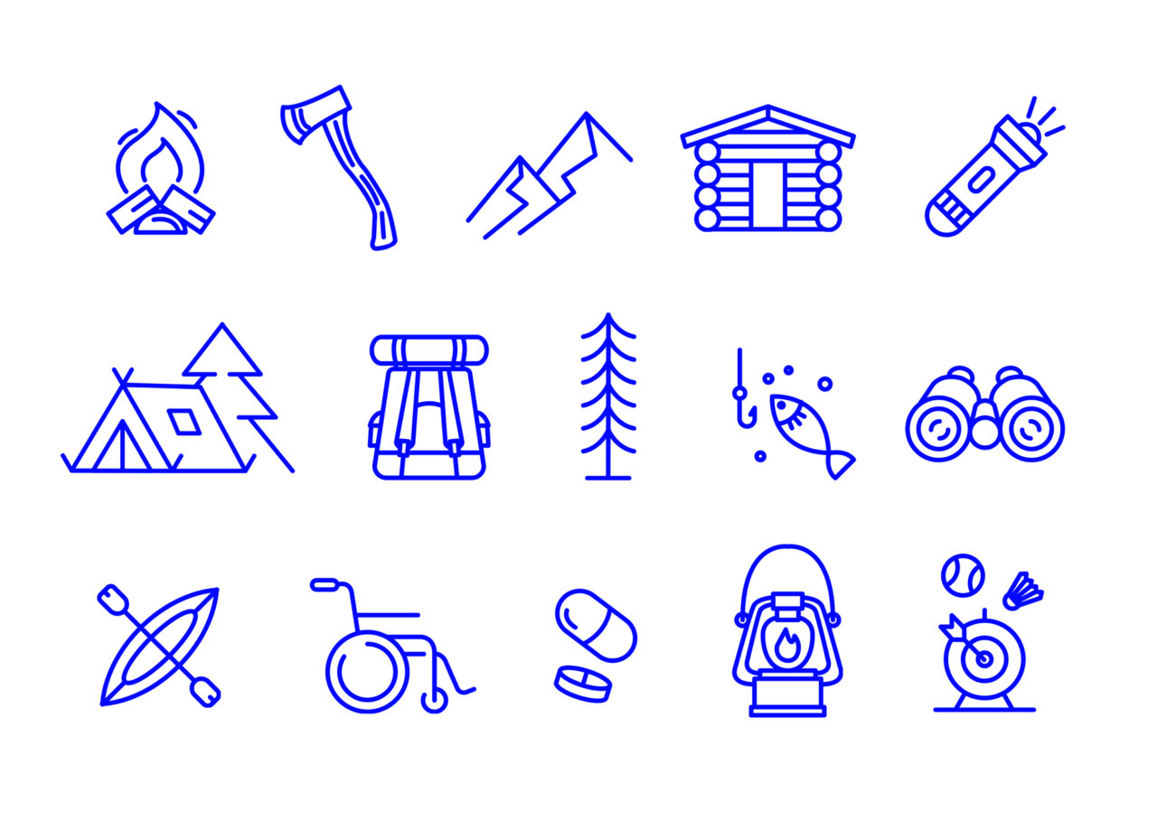
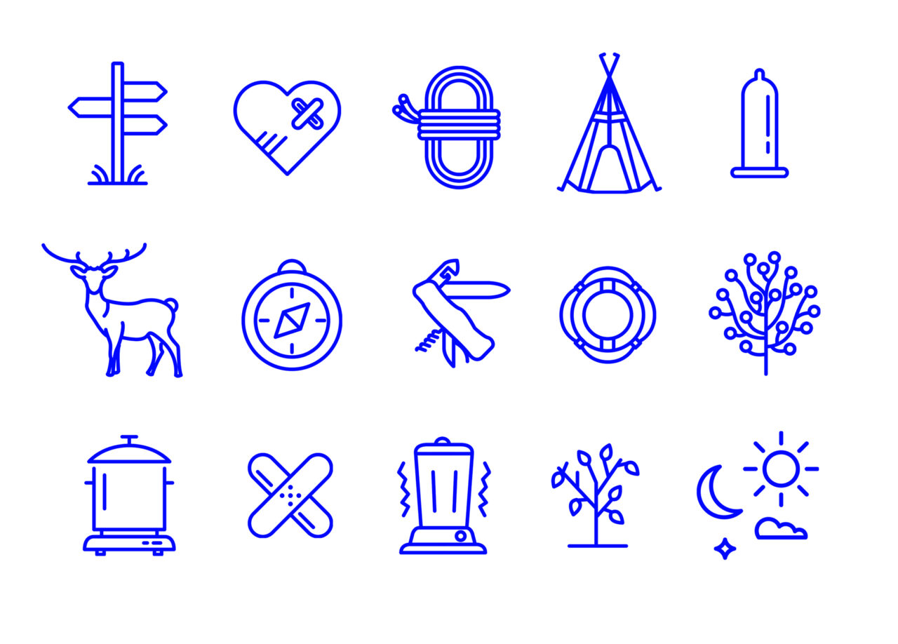
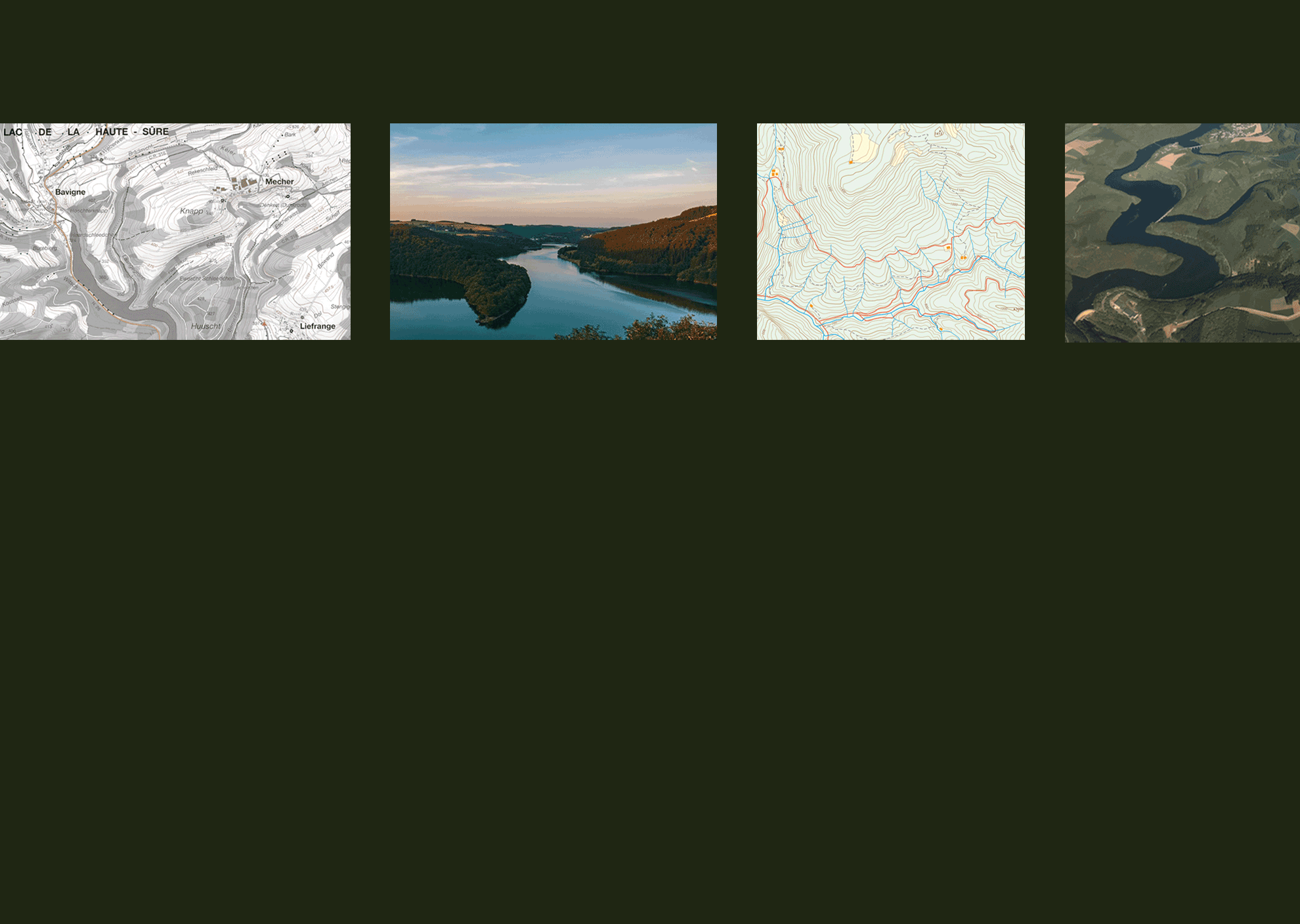
Conception
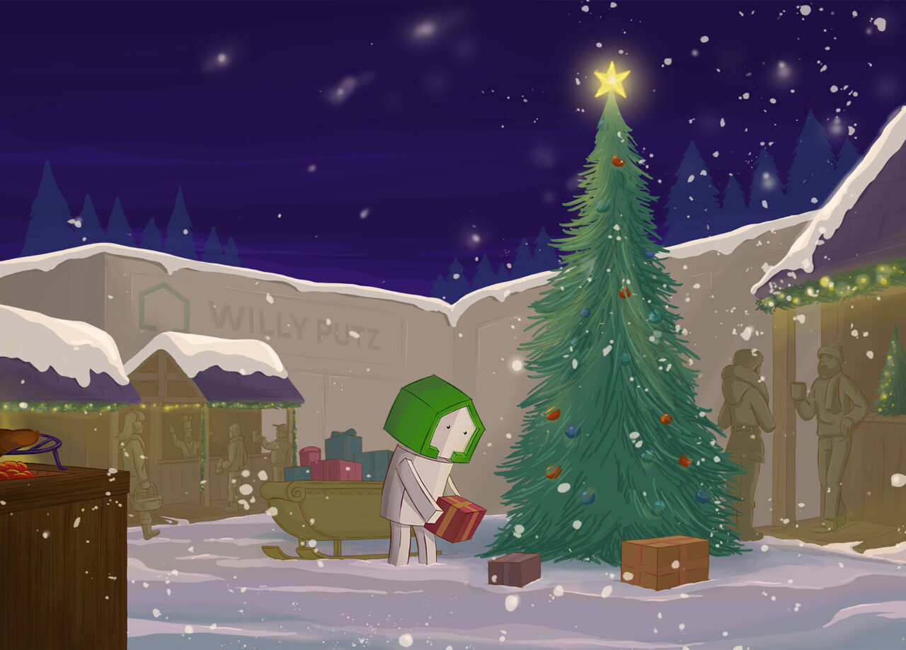
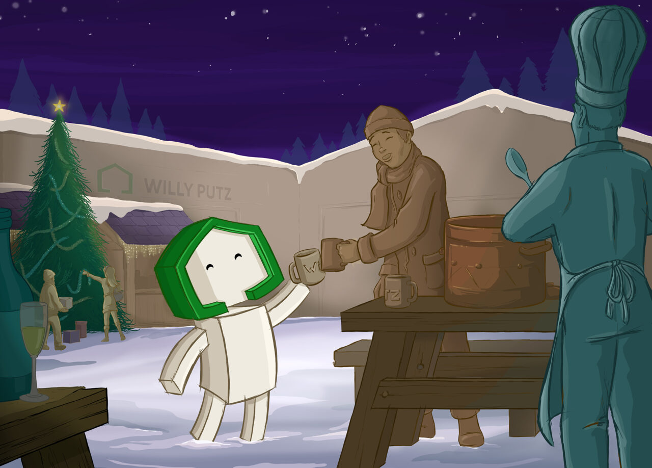
Illustration
Storyboard
Drawings
Photography
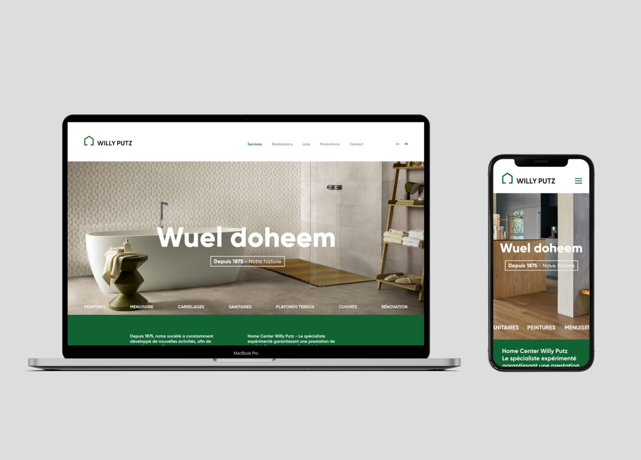
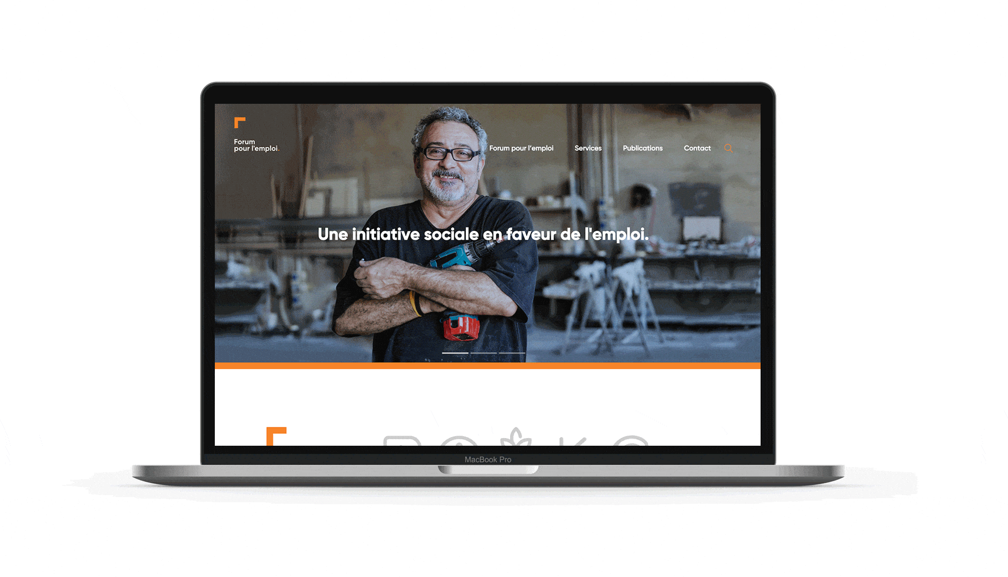
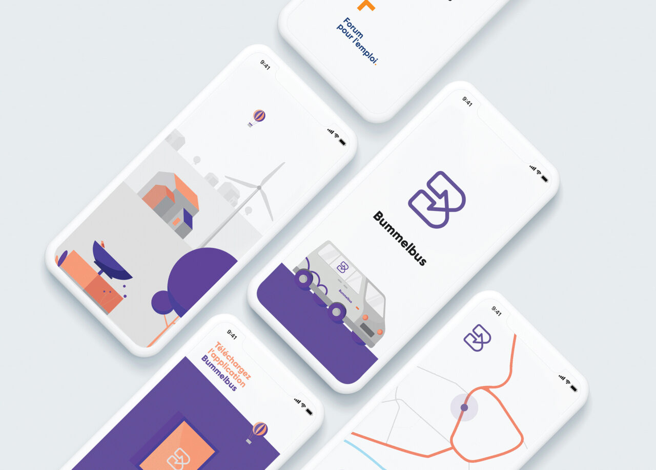
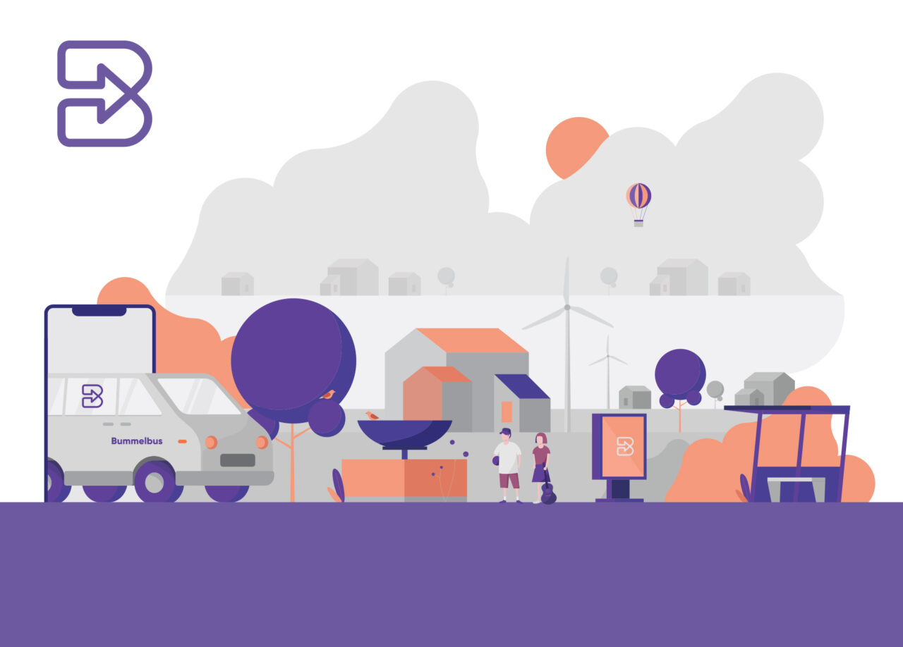
Digital
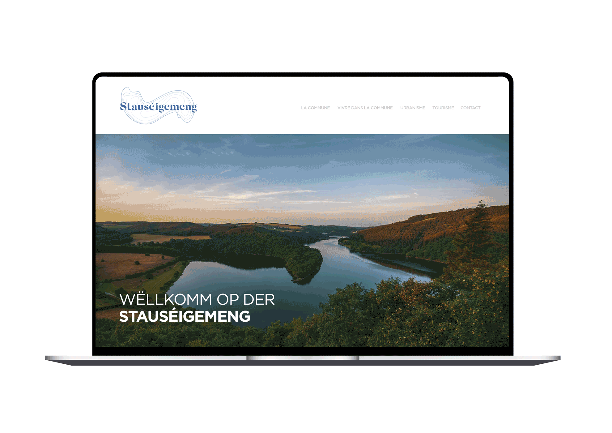
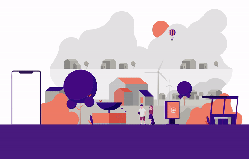
Digital advertising completes the branding circle. With the right content we guide you through all platforms as we offer social media consulting and management. To improve the visibility of a brand or to sell a product we create websites and e-commerces as well as campaigns, animations and videos.
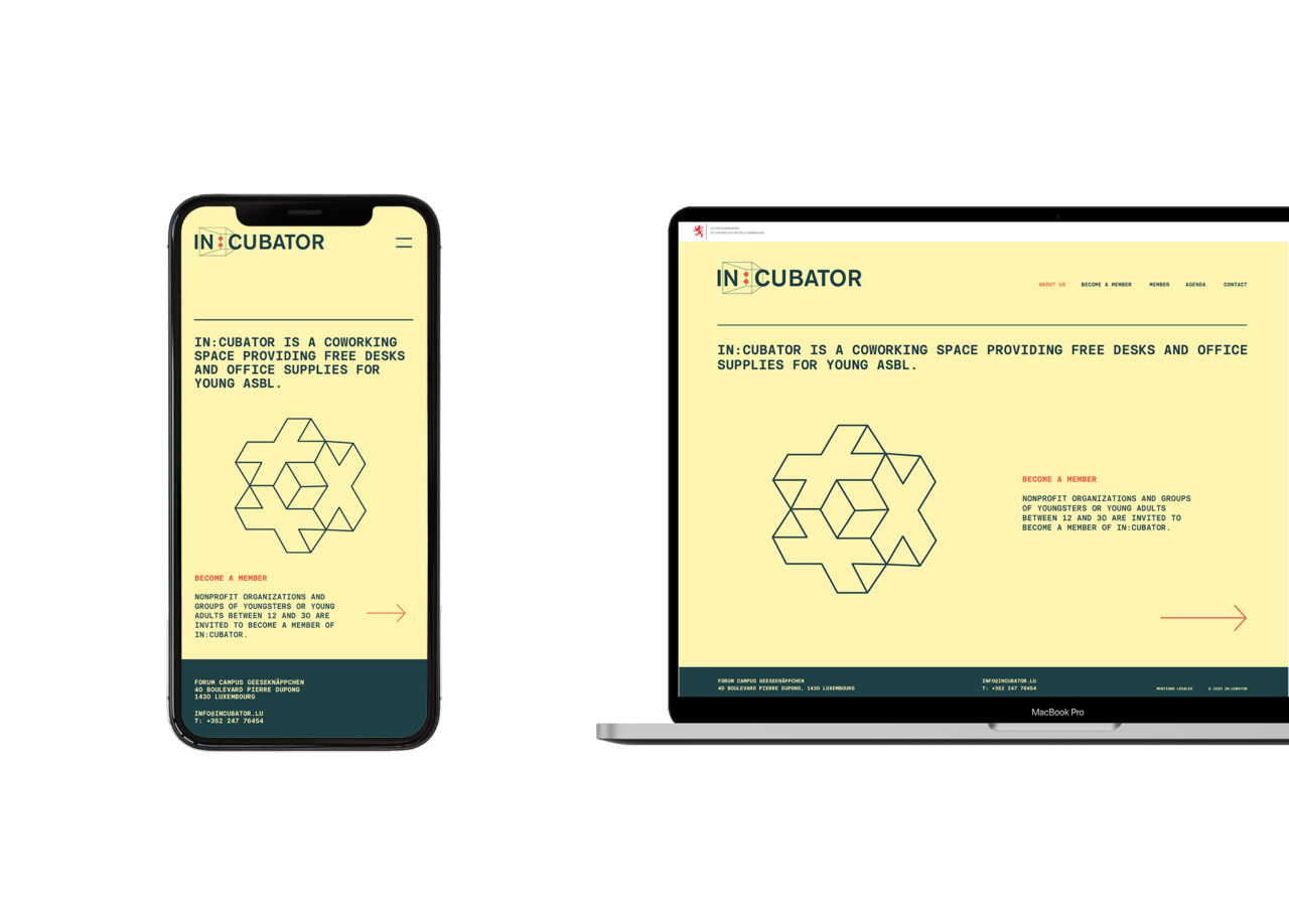
Webdesign
Mobile app design
Digital branding
Social media consulting